

"Flawless typography in multiple languages." "Text rendering on another level." "Near perfect." The loudest reaction to ChatGPT Images 2.0 is about one thing. Text is solved. It's the feature everyone screenshotted.
On the narrow claim, the hype mostly holds up. Can the model render legible, correctly spelled letterforms, even on a curved surface, even in Japanese? Mostly, yes. That problem really did get better.
But rendering text and doing typography are two different questions. Rendering just means drawing the letters correctly. Typography is the harder problem: picking the right fonts at the right size and weight, held in a hierarchy that survives a real brief across multiple edits. The 42 sessions with 7 designers surfaced a clear pattern. The model is better than anything before it, but still not good at the typography that ships, and the gap is specific enough to predict.

The system is right, the characters are wrong
ChatGPT Images 2.0 gets the typographic system right and the characters wrong. Every macro theme landed positive, but every micro theme landed negative.
In the deep dive, the designers consistently iterated on the typography. They fixed some of it in GPT and handed the rest to Figma.

GPT is good at the typographic system and bad at typographic execution. Sort the feedback by theme and the divide is clean. Hierarchy and composition (net +3), brand fit and character (net +3), font choice and style (net +1). All decisions that shape the whole image come in positive. Legibility and readability (net −1), size and weight (net −3), the properties the model has to hold character by character, come in negative.
Every macro theme landed positive. Every micro theme landed negative. On this sample, the split is clean with no single theme crossing the line.
GPT picks on-brand fonts, lays out a hierarchy that reads, and holds composition together across a dense layout. Then it stumbles on the individual characters. A designer on the Sonic Collective brief said:
The text below the SONIC is hard to read, especially "EXPERIMENTAL MUSIC • PERFORMANCE • INSTALLATION • COMMUNITY" at the bottom. Same with the schedule typography — the text looks very generic and not legible.
Iteration fixes one thing and leaves the rest
Iteration fixes contrast, the one thing you can ask for. Every structural problem stays where it started.

The edit data shows the same split holding over time. Editing reliably clears one problem. Lacking contrast, the issue where text sits too faint against its background to read cleanly, falls from 3 mentions at Edit 1 to zero by Edit 3. On the Ridge campaign you can watch it happen. The headline starts washed out, the "U" half-erased and hard to read. A designer asks for it to be sharper and match the visual style, and the next round delivers it. This is the one problem designers can fix by asking.
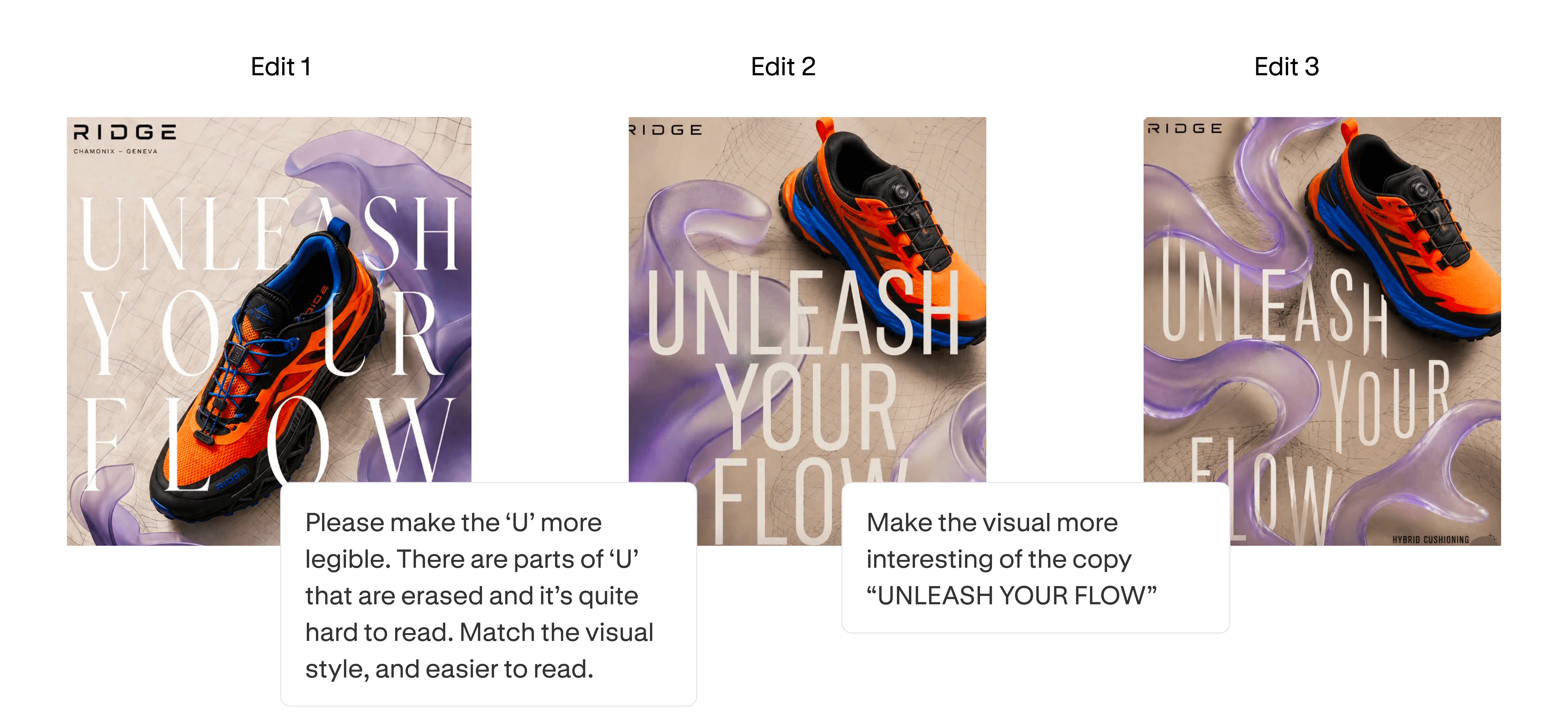
The structural problems don't move. Broken text formatting holds at 3 mentions through every edit, three rounds for zero improvement. On the same campaign, a designer flagged that the "D" in RIDGE renders as an "O". That is what broken text formatting means, and three rounds of editing never fixed it.

Incorrect copy stays at 1 the whole way. And on Sonic Collective, the problem grew. Illegible font showed up at Edit 2, flagged by two designers independently, on a problem the first generation didn't have.

Legibility itself splits along the same line. Contrast is the macro side of it, with one decision per image, and the model fixes it on request, which is why it clears by Edit 3. Size and weight are the micro side, where individual characters matter, and they don't move. Size and weight has zero positives across the whole study. Three designers flagged it as a weakness, none as a strength. The model can make the text stand out but it can't make it hold up.
The climb from 33% to 59% isn't GPT getting better at typography. It's designers fixing the one thing they can, while the structural issues stay put.
Decoration versus deliverable
When type is decoration the model handles it. When type is the deliverable, it breaks.
The pattern also tracks the briefs themselves. When typography isn't the point, the model is fine. When typography is the point, the model breaks.

ASAGI and Studio Citrine are net positive, with zero negative mentions between them. Neither brief was built around typography. ASAGI tested subtle stylistic constraints. Studio Citrine tested realism and texture. Two briefs, Plunge Artesian Pops and Kinetix, drew no typography feedback at all. When the brief doesn't lean on type, designers don't raise it.
That flips when typography is the job.
Sonic Collective was designed to stress typography, iconography, and dense layouts. It nets zero with three positives canceled by three negatives. Ridge, built around dense layouts and small text, came out negative with two positives against three.
The verdict
The decoration-versus-deliverable line is the whole handoff. GPT delivers the typographic system with good visual hierarchy, brand fit, and font choice. That's the macro layer, and it lands early. Figma is for the execution: font size, weight, legibility, down to the individual characters. That's the micro layer, where iteration in GPT runs out of room. Use GPT to design the type system. Take it to Figma to set the type.
Methodology
42 sessions across 7 designers and 6 fictional brand briefs, each run through ChatGPT Images 2.0 with three rounds of edits and recorded end-to-end with Rollout. For the typography analysis, we filtered to mentions tagged as typography-related in the original 16-category prompt tagging, plus typography ratings from the per-edit quality reviews. Each typography mention was coded for sentiment (positive, negative, neutral) and theme.
Themes were derived from individual designer comments: hierarchy and composition, brand fit and character, font choice and style, legibility and readability, size and weight, headline and title treatment, hierarchy of info text, effects and decoration, and a residual "other / general typography" bucket. We then grouped themes into two layers. Macro covers themes that describe the typographic system: hierarchy, composition, brand fit, font choice. Micro covers themes that describe execution: legibility, size, weight. The grouping was applied after coding, not before, and the split fell out cleanly. Every macro theme came in net positive, every micro theme came in net negative.
For the edit-by-edit issue breakdown, we used the typography error categories from the deep dive's per-edit reviews: Incorrect or Incoherent Copy, Broken Text Formatting, Incorrect or Illegible Font, Lacking Contrast or Not Readable, and a residual "Other" category for one-off issues that didn't recur across iterations.
Limitations
Typography sentiment was coded from the same designer transcripts and self-ratings used in the deep dive, with the same self-assessment bias. The sample is small, and we treat these as directional, not calibrated. The patterns, however, hold across edits, themes, and briefs in the same direction.
How we ran this study → Methodology