

Claude Opus 5 and Claude Fable 5 finished at the top of our landing-page study. Opus led overall, winning 59.4 percent of its comparisons, with Fable close behind at 57.1 percent. Opus led on visual aesthetics and general preference, while Fable led on prompt adherence and usability.
The two Claude models took the lead later in the design stages. GPT-5.6 Sol led ideation, when the job was to shape the first direction. Opus took over at mockup, and Fable finished first in refinement, with Kimi K3 and Gemini 3.6 Flash close behind.
The Human Creativity Benchmark now expands on landing pages
Earlier this year, we introduced the Human Creativity Benchmark to measure how generative models perform on professional creative work. We are now expanding it one domain at a time.
After ad images and ad videos, this study turns to landing pages. It looks at how models perform across ideation, mockup, and refinement, from shaping the page structure to applying a visual system and making specific revisions.
Six models built landing pages for three products across three stages
We tested six models:
- Claude Opus 5
- Claude Fable 5
- Codex (CLI) GPT-5.6 Sol
- Kimi K3
- Gemini 3.6 Flash
- Muse Spark 1.1
The prompts covered three fictional product launches: Arbórea, a pair of headphones made with walnut and recycled aluminum; Luma, a zero-sugar passion-fruit iced tea; and EPOCH, a configurable desk with lighting modes and built-in cable management. Each product moved through three stages: ideation, mockup, and refinement. Across the three products, that gave us nine prompts in total.

Ideation covered the page structure, content order, and purpose of each section. Mockup added a defined visual system. Refinement kept the page in place and asked for specific fixes such as stronger contrast, cleaner spacing, slower motion, or a corrected hover state.
Six designers reviewed every prompt. They saw all six outputs and compared every pair with the model names hidden. Designers compared each pair on four criteria.
- General preference: Which output would you carry forward at this point in the project?
- Usability: Which output would you be more likely to use in a real client project?
- Prompt adherence: Which output followed the prompt more closely?
- Visual aesthetics: Which output looked better?
The evaluation produced 3,240 pairwise decisions and 324 written responses about the strengths and weaknesses of individual pages.
Win rate is simply the share of comparisons a model won. We also calculated a Bradley-Terry Elo rating from the head-to-head record, using 1,500 as the baseline. It adjusts the result for the strength of the opponent.
Opus and Fable lead overall
Opus won 59.4 percent of its comparisons across all four dimensions. Fable finished 2.3 points behind at 57.1 percent. GPT-5.6 Sol and Kimi made up the next close pair at 52.1 and 50.7 percent. Gemini won 45.5 percent. Muse trailed at 35.2 percent.

Elo ratings had the same order: Opus at 1,556, Fable at 1,542, GPT-5.6 Sol at 1,513, Kimi at 1,505, Gemini at 1,473, and Muse at 1,411. The confidence intervals overlap for Opus and Fable, and again for GPT-5.6 Sol and Kimi, which means we cannot confidently rank one model above the other within either pair.

The head-to-head results were narrow too. Opus beat Fable 56 percent of the time. Both beat GPT-5.6 Sol in 54 percent of their meetings. GPT-5.6 Sol versus Kimi was almost a coin flip at 51 percent.
GPT-5.6 Sol finished first 19 times, just one fewer than Opus. When it did not win, though, it rarely stayed near the top. It finished second only twice and last ten times, more than double Opus's four last-place finishes. GPT-5.6 Sol could produce the strongest page in the group, but its performance was harder to rely on from one prompt to the next.
Fable followed a different pattern, finishing first nine times and second 18 times, so Fable consistently finished ahead of most of the other models. GPT-5.6 Sol lost most of its comparisons whenever it fell near the bottom. That consistency put Fable ahead overall, even though it finished first fewer than half as often as GPT-5.6 Sol.

Opus led on preference and aesthetics, and Fable led on usability and adherence
Opus had a clear advantage when designers picked the page they preferred, winning 64.1 percent of those comparisons. Fable followed at 57.8 percent. GPT-5.6 Sol and Kimi were nearly even at 50.0 and 49.3 percent, followed by Gemini at 43.0 percent and Muse at 35.9 percent.
That advantage largely disappeared on usability. Fable led at 57.0 percent, only 0.3 points ahead of Opus. GPT-5.6 Sol reached 54.1 percent, Gemini 51.1 percent, and Kimi 50.4 percent. Just 6.6 points separated the top five models. Muse remained well behind at 30.7 percent.
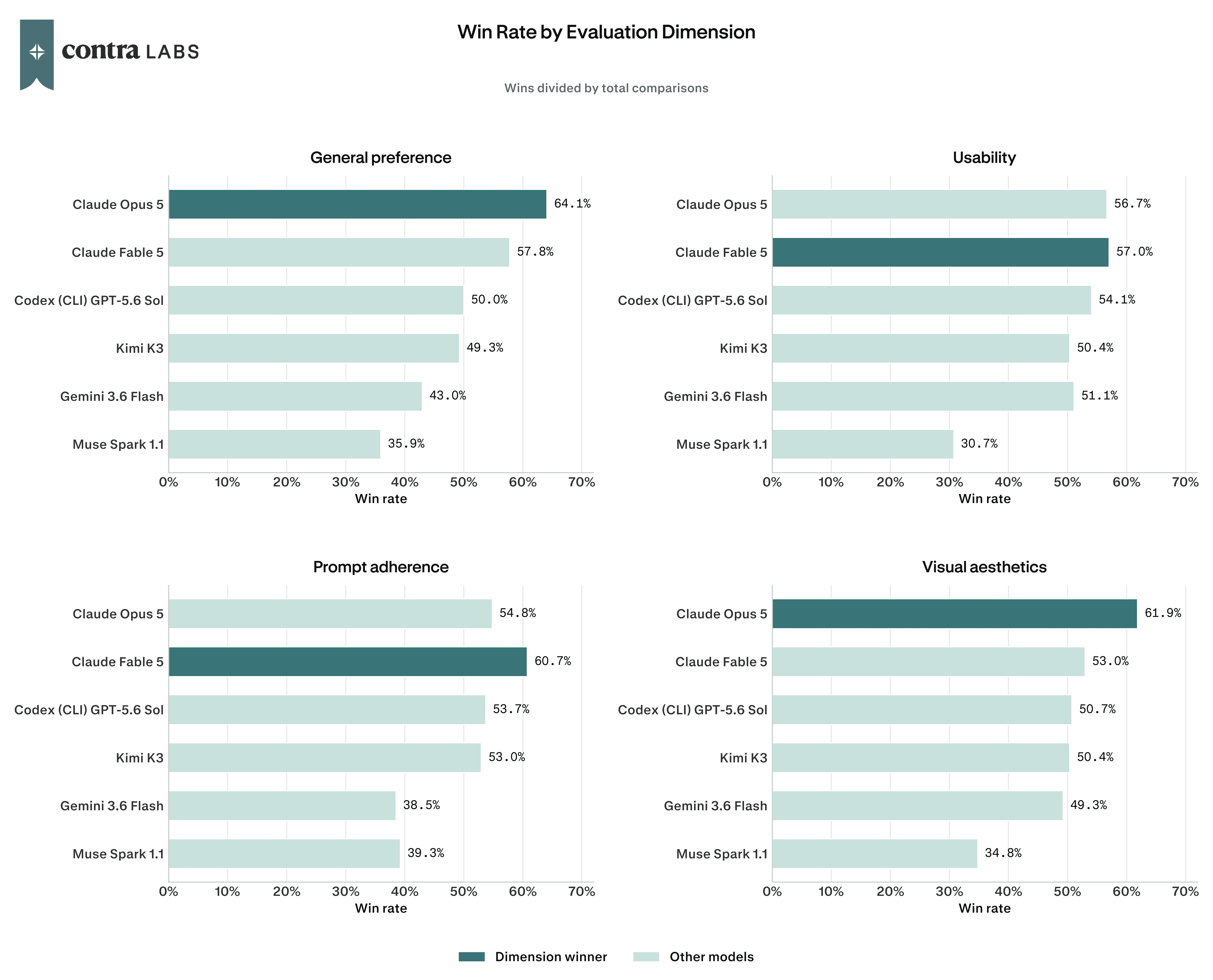
Fable scored highest on prompt adherence at 60.7 percent. Opus, GPT-5.6 Sol, and Kimi landed between 53.0 and 54.8 percent, with Muse and Gemini below 40 percent. Opus had the clearer advantage on visual aesthetics, reaching 61.9 percent against Fable's 53.0 percent. GPT-5.6 Sol, Kimi, and Gemini were grouped between 49.3 and 50.7 percent, and Muse finished at 34.8 percent.
That split helps explain why Opus and Fable finished so close overall: reviewers preferred Opus and rated it higher visually, but Fable followed the prompts more closely and had a slight edge on usability.
A different model led each design stage
GPT-5.6 Sol started strongest in ideation. Opus pulled ahead at mockup, and Fable narrowly led refinement. The overall ranking combines those three different parts of the design process.

GPT-5.6 Sol led ideation
GPT-5.6 Sol was strongest before the visual system was defined, when the models had to decide what belonged on the page and how to organize it. It won 66.1 percent of the ideation comparisons, followed by Opus at 60.0 percent and Fable at 50.3 percent. Kimi, Gemini, and Muse were tightly grouped between 40.3 and 41.9 percent.
Opus was the clear leader in mockup
Once the prompts defined the colors, typography, imagery, and art direction, Opus won 70.8 percent of its comparisons. That was the highest score any model recorded at any stage. Fable followed at 61.4 percent and Kimi at 51.9 percent.
GPT-5.6 Sol's strong ideation result did not carry into mockup. Its win rate fell 23 points to 43.1 percent, followed by Gemini at 38.9 percent and Muse at 33.9 percent.
Fable narrowly led Kimi and Gemini in refinement
Only 3.6 percentage points separated the top three models in refinement. Fable led at 59.7 percent, with Kimi close behind at 58.3 percent and Gemini at 56.1 percent. Opus and GPT-5.6 Sol each won 47.2 percent of their comparisons, and Muse finished at 31.4 percent.
Opus had the largest change. After leading mockup at 70.8 percent, it fell to a tie for fourth when the models were asked to apply a short list of fixes. Producing the strongest mockup did not translate into the strongest refinement result.
Kimi moved steadily in the other direction, rising from 41.9 percent in ideation to 51.9 percent in mockup and 58.3 percent in refinement. Gemini also improved in later design stages, climbing from 38.9 percent in mockup to 56.1 percent in refinement. Both finished the final stage ahead of GPT-5.6 Sol and Opus, the models that had led ideation and mockup.
What designers noticed about each model
Each model received 54 written responses across nine prompts. Reviewers commented on specific parts of the pages, including hero layouts, typography, spacing, imagery, and interactions.
Opus's visual style and brand fit stood out
Visual style and brand fit was the most common praise in Opus's feedback, appearing in 16 of 54 responses. Reviewers highlighted its color, typography, photography, and mood across all three products. Copy and content quality was another strength, with nine positive mentions.
Solid option. Visually interesting hero layout. I love that the product render has no background. Overall, an interesting and dynamic layout with good font choices.
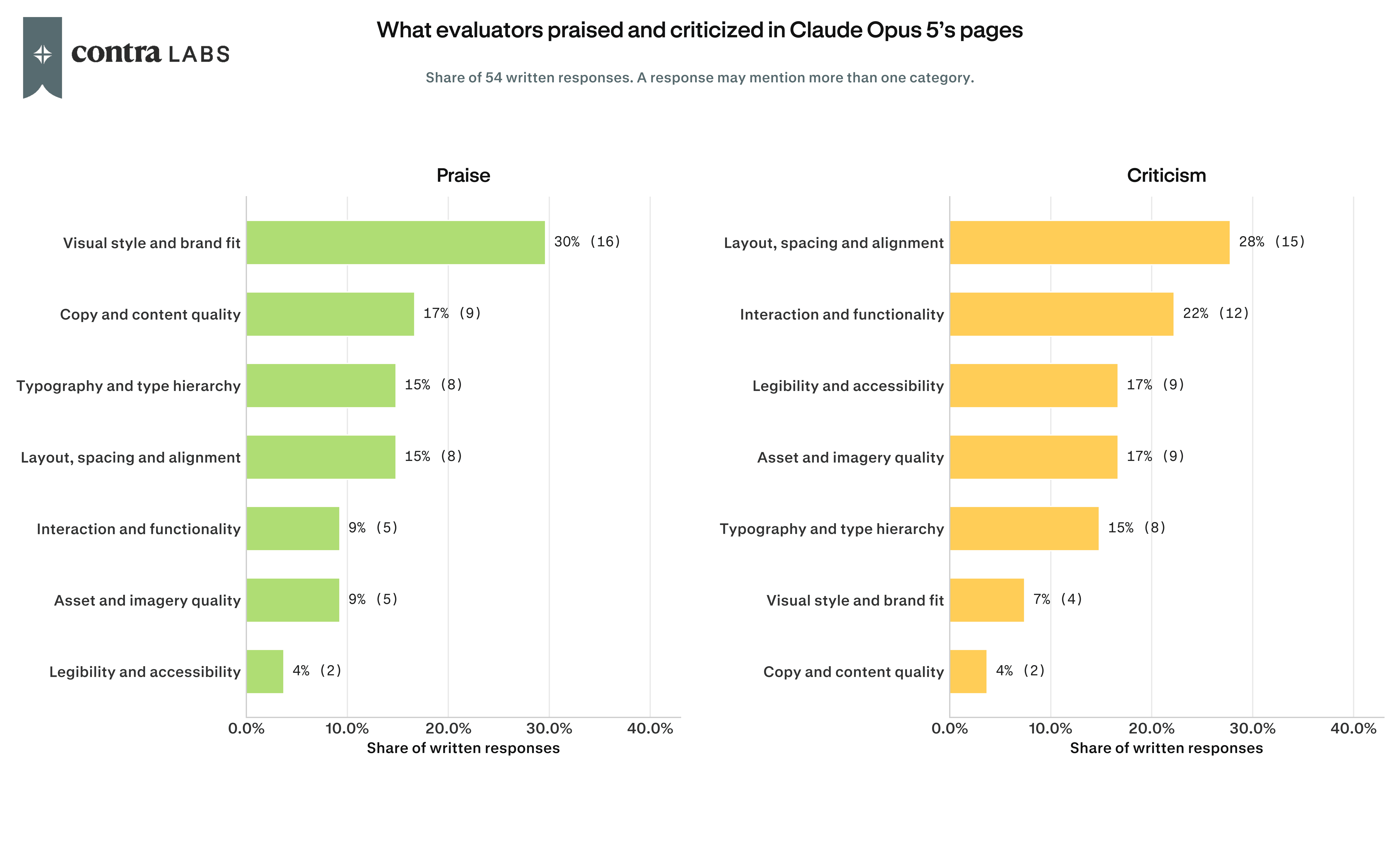
Layout, spacing, and alignment drew the most criticism, appearing in 15 responses. Interaction problems followed in 12. Reviewers found overlapping text, duplicated sections, large gaps, jumping FAQs, and controls that did not work. Incorrect imagery and low-contrast text also appeared across several pages.
The weakness is the massive unexplained gaps between every section. It is the same broken spacing issue as the previous output and makes the page feel completely unfinished and unusable as a real landing page.
The Arbórea mockup below won 88.3 percent of its comparisons and led every other model across all four dimensions. It won 96.7 percent on visual aesthetics and 93.3 percent on general preference. Opus was the only model to make the headline and headphones one composition, closely following the directions to crop the product and overlap the earcup. Its typography, restrained palette, and editorial use of photography led one reviewer to say the page "really feels like it could be a printed catalogue."

See the full pages here: Kimi K3 · GPT-5.6 Sol · Gemini 3.6 Flash · Claude Fable 5 · Claude Opus 5 · Muse Spark 1.1
Fable's copy and visual direction were stronger than its page layouts
Fable's praise was split between visual style and copy, which received positive mentions in 14 and 13 of its 54 responses. Reviewers liked its color, photography, typography, and fully written page content.

By far the best result. Strengths: spacing and fonts; the materials section is well organized; the sound section delivers the idea instantly; and the comparison section has CTA buttons below.
Fable received the most criticism for layout, spacing, and alignment, which appeared in 20 responses. Asset and imagery problems appeared in ten. Reviewers found incorrect product images, oversized gaps, weak hero composition, and missing or duplicated sections.
The weakness is the same massive dead space between every section. This is now a consistent bug across multiple outputs and makes the page unusable as a real landing page.
The EPOCH refinement below won 71.7 percent of its comparisons, leading every other model on general preference and usability for this prompt. One reviewer saw the requested fixes as successfully applied:
Clean and fixes read as applied. The mode cards show the same desk composition across Focus, Session and Wind-down with contained lighting and no bleed. The mono spec text is legible and the size numerals sit on a level baseline across all three cards, the announcement counter reads as quiet mono without a pulsing dot and the footer refund line is clearly readable.

See the full pages here: Kimi K3 · GPT-5.6 Sol · Gemini 3.6 Flash · Claude Fable 5 · Claude Opus 5 · Muse Spark 1.1
GPT-5.6 Sol combined strong page ideas with recurring layout errors
GPT-5.6 Sol's EPOCH ideation page won 81.7 percent of its comparisons. It led every other model on general preference, prompt adherence, and usability for this prompt. Reviewers praised the clear product story, from the direct hero to the exploded cable-management diagram. One called the diagram "genuinely technical and impressive" and praised its "good visual storytelling."

See the full pages here: Kimi K3 · GPT-5.6 Sol · Gemini 3.6 Flash · Claude Fable 5 · Claude Opus 5 · Muse Spark 1.1
Across the study, GPT-5.6 Sol received praise for ideas that made a product easier to understand, including EPOCH's width picker and cable diagrams, clear product cards, and strong hero concepts. Several pages felt specific to the product instead of relying on a standard landing-page layout.
The Arbórea mockup landing page looks really premium and does a great job matching the print catalogue style from the prompt. I like the oversized cropped product image, the typography, and the earthy color palette. It all feels very polished and high end.

Reviewers also found overlapping headings, cut-off text, duplicated content, missing images, and visual choices that changed from one section to the next. These were often local problems inside otherwise strong page concepts.
The 'Find your working width' headline is cut off by the section above it, and the FAQ heading is partly cut off too. These read as real layout bugs, not style choices.
Gemini organized sections well but struggled with imagery and spacing
Gemini's best sections were clean, easy to scan, and well organized. Reviewers praised its width selectors, technical diagrams, typography, and comparison tables, especially during mockup and refinement. Those strengths often sat beside incorrect product imagery, missed hover states, overlapping text, weak contrast, and uneven spacing.
The individual content blocks themselves look clean. The hero, materials, and width-picker sections all read fine on their own. The mood-lighting trio and closing CTA are legible and consistent with the rest of the page.
The weaknesses are the wrong images and product, no hover state on the buttons, a comparison section that is hard to read, and the fact that clicking anywhere opens the cart. The footer and CTA are also weak.

The Arbórea refinement below won 65.0 percent of its comparisons, Gemini's best result. It led usability for this prompt and tied Opus on general preference. Reviewers found that Gemini improved the announcement-bar contrast, replaced the comparison table's red X marks, tightened the FAQ spacing, and gave the newsletter its sand background. Gemini still kept the headline and earcup in separate columns.

Kimi's technical sections were stronger than its imagery and spacing
Reviewers most often praised Kimi when a page needed clear technical explanations and usable controls. Cable diagrams, width selectors, product cards, and FAQ sections were easy to read, and its later-stage pages were more consistent than its ideation work.
Everything reads cleanly from top to bottom, with no overlap or cut-off text. The cable and hardware diagram is legible and technical without being cluttered. The width picker, size cards, and pricing are easy to scan and compare.

Other landing pages were held back by incorrect hero imagery, weak contrast, uneven spacing, or an art direction that did not carry through the full page. Kimi could organize detailed product information well and still miss the intended visual treatment.
Almost the entire page below the hero looks washed out under a dark overlay, though. The text and images have very low contrast and are hard to read. It could be a rendering bug rather than a design choice, but it hurts readability throughout the middle of the page and feels unfinished.
The EPOCH mockup below won 67.5 percent of its comparisons. Reviewers praised the disciplined type system, the technical cable diagram, and a size selector that was easy to compare. The lighting modes were less successful. Instead of using the same desk composition with different glow temperatures, Kimi used three different scenes in similar neutral light, leaving the violet-to-teal system barely visible.

Muse often included the right sections, then lost ground on layout
Reviewers occasionally praised Muse's visual direction and copy, but its feedback was dominated by layout problems. Visual style and brand fit appeared as praise in 10 of 54 responses, followed by copy and content in eight. Layout, spacing, and alignment drew criticism in 28 responses, with legibility and imagery also recurring problems.

Strong, faithful build. The navigation, hero, spec strip, materials rows, quote and reviews, comparison table, FAQ, and full conversion blocks are all present and on prompt.
Problems recurred across all three products. Headings were oversized or overlapped, spacing changed without a clear reason, product images did not fill their frames, and small labels lost contrast. Reviewers also found unrelated imagery and interactions that did not work.
In the hero, the H1 breaks into four lines, which is not the best for the layout balance. The image should have rounded corners, and it has inconsistent padding. The tags need more contrast, and some text is too small and hard to read.
The Arbórea ideation page below was Muse's strongest result, winning 61.7 percent of its comparisons and finishing behind only Fable and Opus. It included nearly every requested section, from the materials story and comparison table to the FAQ and final purchase block. The hero was less controlled: the headline stretched across four lines, the product sat low in its frame, and the finish selector appeared there even though the prompt reserved it for the final conversion block.

Which model fits each design stage
For the first pass, GPT-5.6 Sol is the strongest choice. It was best at turning a prompt into a page structure, deciding what belonged on the page, and developing ideas specific to the product. Its concepts were often stronger than their execution, so overlaps, awkward line breaks, and low-contrast labels still need attention.
Once the structure is in place, Opus is better suited to establishing the visual direction. It had the largest stage advantage in the study and received the strongest feedback on typography, photography, color, and overall presentation. Some of its pages looked finished before the interactions were ready, making the cart, FAQ, hover states, and required content worth checking closely.
Refinement was more competitive. Fable narrowly led the stage and also finished first on prompt adherence and usability overall. Kimi and Gemini were close behind, with both improving as the prompts became more specific. Kimi's performance rose at every stage, while Gemini made its largest gain between mockup and refinement.
Muse finished behind the other five models overall and did not lead any stage. Its Arbórea ideation page showed that it could build a complete and thoughtful page structure, but that quality did not appear consistently across the nine prompts.
An ideal workflow could start with GPT-5.6 Sol for the page structure, move to Opus for the visual system, and use Fable for the final revisions.
Limitations
Three projects are a narrow base for a ranking. Arbórea, Luma, and EPOCH use different products and visual systems, but all three are product-launch pages. A marketplace, portfolio, service business, or editorial site could produce a different order. Each stage result also rests on three prompts, so the stage rankings are directional. We will continuously expand on the scale of data collection.
Six designers completed 3,240 pairwise decisions. Krippendorff's alpha was 0.522, which indicates moderate agreement. Where the confidence intervals overlap, the study cannot confidently place one model above the other.
Win rate and Elo are relative to these six models. A 50 percent usability win rate means the model won half of its usability comparisons in this study.
We used an LLM to classify 324 written responses into a fixed set of themes, then checked the original comments when making specific claims. The themes are useful for spotting repeated issues, but they simplify what each reviewer wrote.
The image examples show a strong or representative prompt for each model. They show a ceiling or a recurring pattern, rather than the average output.
These results apply to the model versions, prompts, and tools tested in July 2026.
How we ran this study → Methodology