

Where the Human Creativity Benchmark started
Earlier this year, we published the Human Creativity Benchmark (HCB), a benchmark that measures generative models on professional creative work. The framework had three commitments:
First, diverse creative domains and output types: Landing pages, Desktop applications, Ad images, Brand assets, and Product videos. Second, we designed three phases per task, ideation, mockup, and refinement, following realistic creative workflows. Prompts were built sequentially, with earlier outputs fed forward as inputs. Lastly, we elicited realistic prompts directly from creative professionals. Working designers in Contra's network authored the briefs and supplied the input media, against structural requirements covering prompt length, camera angles, and color palettes. The benchmark tests what designers ask models to do, not what benchmark authors imagine they ask.
The pilot ran 93 prompts across 80 evaluation sessions and produced 5,940 pairwise judgments, 5,940 scalar ratings, and 3,675 written rationales. Roughly 15,000 individual judgments in total. Two results from that pilot shaped the expansion: no single model led all three phases in any domain. And usability behaved like a gate rather than a score: 84 percent of ad images rated 5 on usability finished in the top two ranks, against 10 percent of images rated 1.
Expanding and Scaling the Human Creativity Benchmark
We are now expanding HCB from a pilot into a standing benchmark, one domain at a time. We will first expand to these outputs and domains:
- Images (Ad images, brand assets)
- Videos (product shots, cinematic videos)
- Code (landing page, web apps)
We are starting with ad images, with the rest of the categories following in the next few weeks.
Why ad images? It is paid professional work with a clear brief and a clear deliverable. Someone is being hired, and the output either ships to a client or does not.
The domain also has many details that AI models have not completely nailed yet, such as product consistency, text legibility, lighting and material realism, etc. Many of these are not matters of taste. A garbled product label is wrong, and we need to fix these issues in the models first before they can be effectively used in creative workflows.
What We Expanded
Six image models, three client campaigns, three phases each. Nine prompts in total.
- Meta Muse Image
- ChatGPT Images 2.0
- Nano Banana Pro
- FLUX.2 [max]
- Grok Imagine 1.0
- Krea 2 Medium
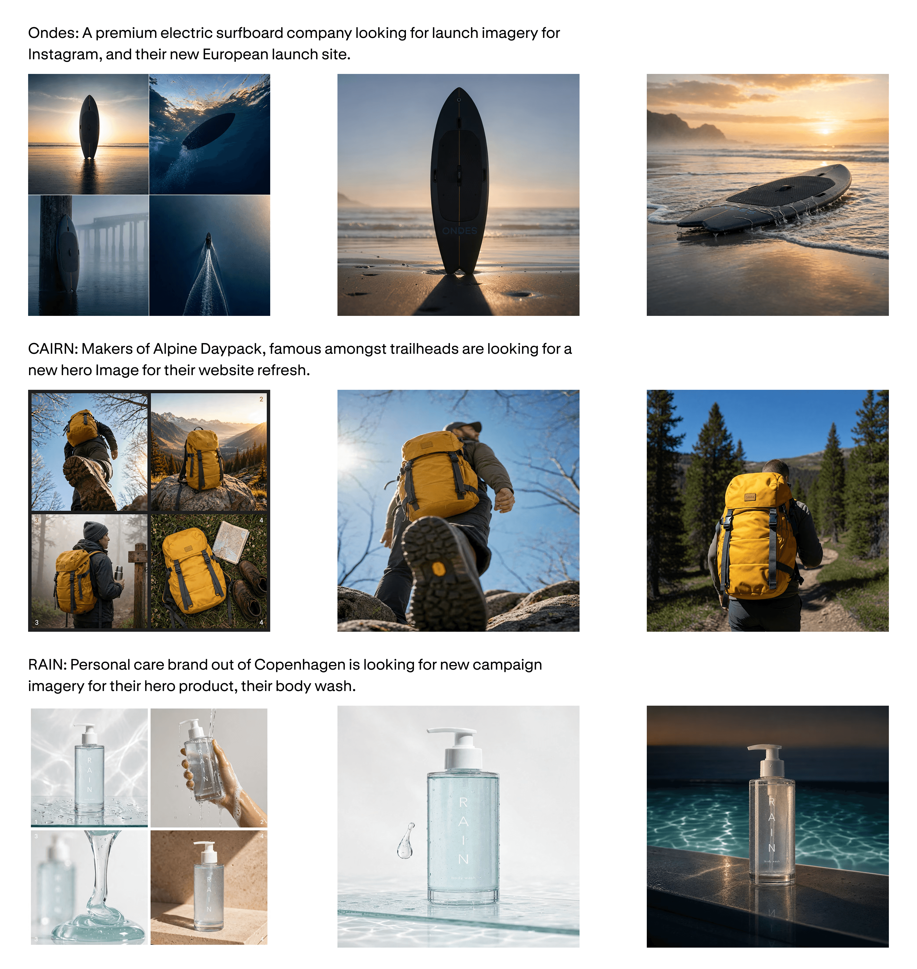
The campaigns are a surfboard brand, a backpack brand, and a body wash brand. Each brief carries the business context, the product, and the client need.
Evaluators are graphic designers, ad designers, and creative directors, recruited from Contra. Each evaluator sees all six outputs per prompt and compares them head to head. Every pair is judged four times, once per dimension:
- General preference. Which output has the stronger general quality? The exact question changes by phase: which would you develop further at ideation, which would you present to the client at mockup, which would you ship in the deliverable at refinement. We also asked the evaluators to add a written rationale for the preference selection.
- Usability. Which output are you more likely to use in a real client project? This measures the practical value of the AI-generated output.
- Prompt adherence. Which output more faithfully executes what the brief asked for?
- Visual aesthetics. Which output looks better visually? Consider visual quality dimensions such as composition, hierarchy, color, etc.
Meta Muse Image Ranks #1 by Professional Creatives
Across the full set, the recently launched Meta Muse Image was the clear winner, with a 68.9% win rate. ChatGPT Images 2.0 and Nano Banana Pro are close behind.

Breakdown by Creative Workflow Phases
Across the three phases, the same three models hold the top of the overall table, with their positions changing at each phase. Mockup is the exception, where Flux.2 [max] leads ChatGPT Images 2.0 and Nano Banana Pro. This indicates that their capabilities are consistently stronger than the remaining three models. However, for the 3 top models, their rankings for each phase slightly change:
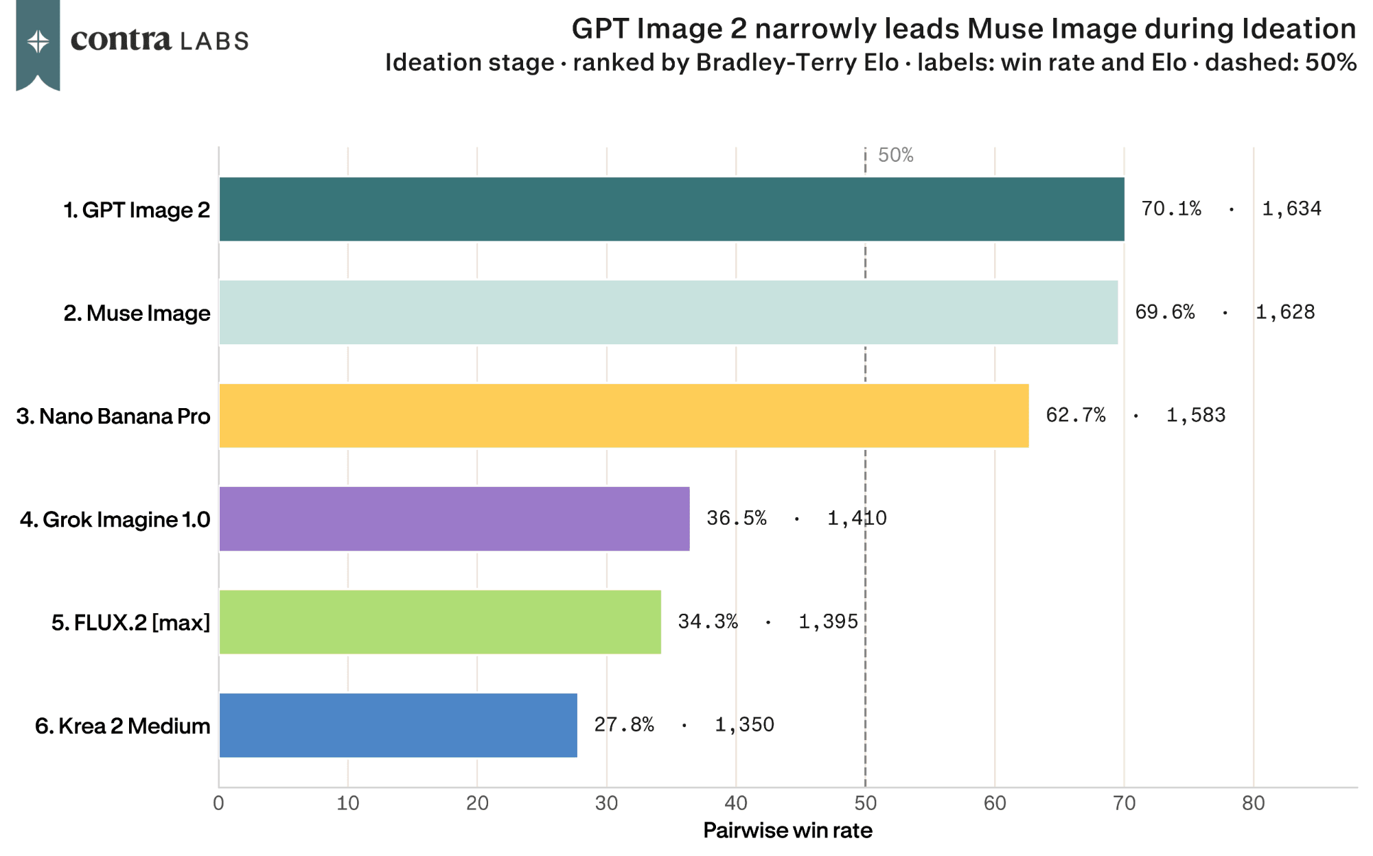
In the ideation phase, ChatGPT Images 2.0 and Muse Image are both closely ahead, showcasing strong ideation capabilities. The written rationales reward them for one thing: adherence to the prompt. One evaluator, picking ChatGPT Images 2.0, said its output was "closest to what I imagined while reading through the prompt"

In the mockup phase the pattern breaks with FLUX.2 [max] jumping to second from fifth place at ideation the moment there is a chosen direction to execute, while ChatGPT Images 2.0 falls into a tie with Nano Banana Pro. This is also the phase where the field spreads widest, which makes it the point in the workflow where choosing the right model pays the most.

The right side output does a better job of aligning with the requested prompt details than the left side one. The right side output also correctly uses the honest lens flare and visible grain details as mentioned in the prompt.
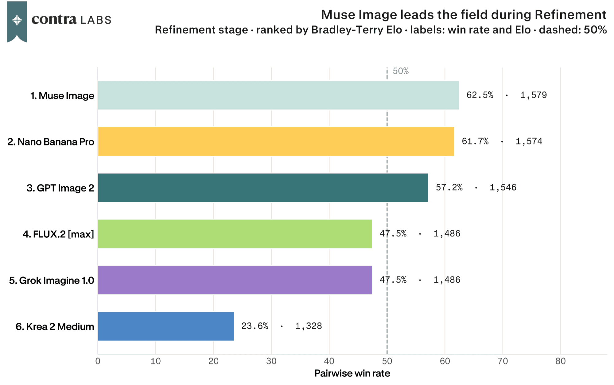
Refinement is the opposite story with all models very close to each other. Nano Banana Pro recovers from its mockup dip to nearly catch Muse, with the two models finishing less than a point apart. Once the task narrows to applying specific edits, most of the field performs about the same. This is the phase to optimize for cost or speed.

Each evaluator wrote a free-text rationale for every choice in the General Preference round, in their own words. Classifying those rationales gives a rubric of what the evaluators kept checking for. Evaluators frequently looked at whether the product looks like the actual product, if the logo holds, if the images look real, and if the output adheres with the prompt. Product and reference accuracy leads the praise for five of the six models, and realism sits near the top for most.

The phases also change the metrics being looked at: at ideation evaluators also weighed the direction, and by refinement, when the brief has narrowed to a short note, the models only differ in what remains: each has a signature quality, and a characteristic way of failing.
A Closer Look At Each Model
Muse Image

It draws the least criticism in the set by a wide margin, roughly seven mentions of praise for every one of criticism, and designers kept choosing it even when they liked the other image more. One evaluator, comparing concept boards for the surfboard campaign, put it plainly:
In this case, although the photography in the left output is in higher adherence to the prompt guidelines, it does not represent the product in a way that is usable. The right side output properly showcases the product and is very close to the brand feeling and representation needed.

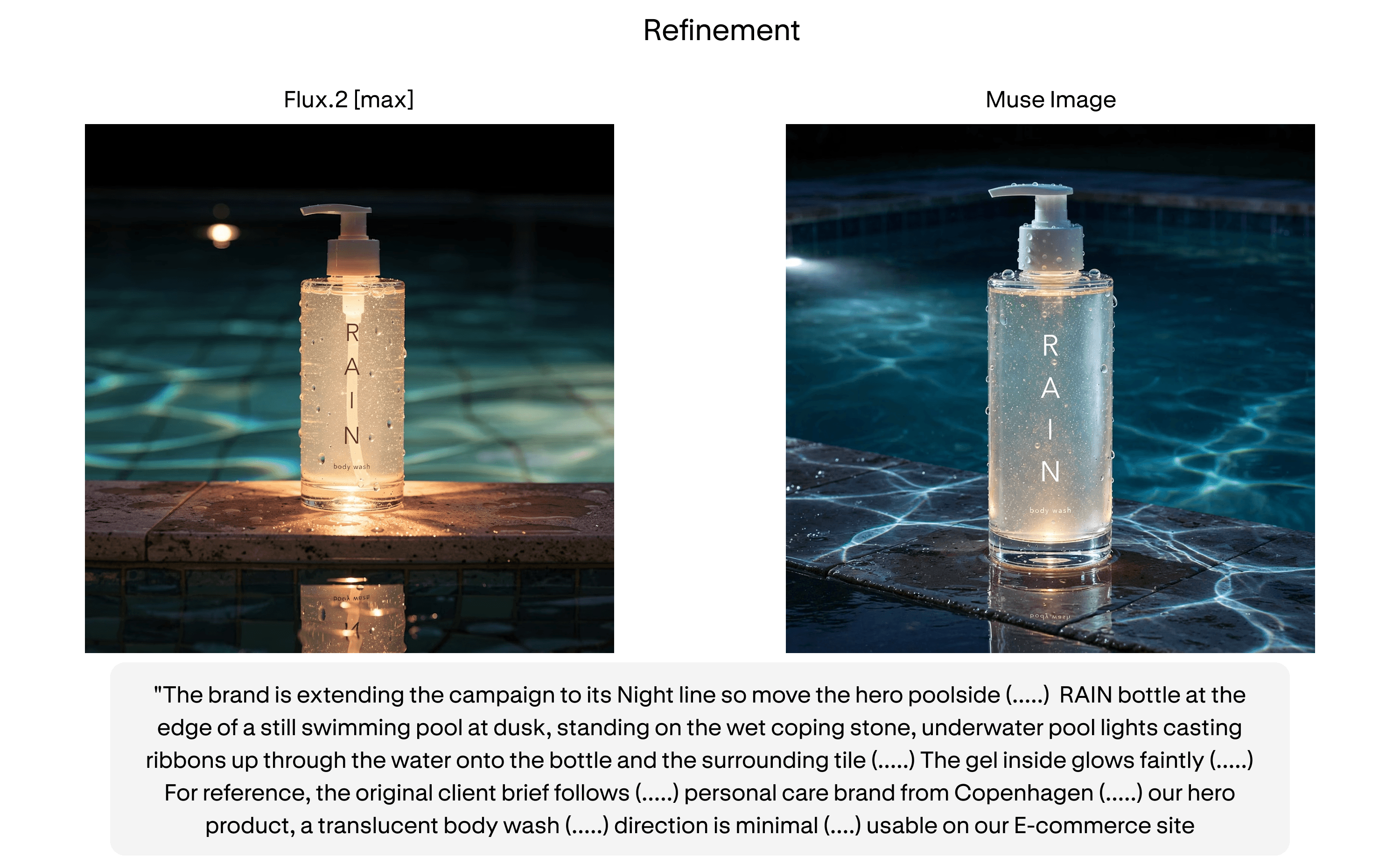
Its signature failure is polish. Nearly a third of its criticism is one category, realism and naturalism at 29.5 percent. On the body wash campaign's poolside brief, the same evaluators who kept voting for it described:
The left side output has more accurate product depiction and environment setting, with realistic reflection in lower foreground. The right side output features weird glitter within the product bottle, and unrealistic light refractions on the stone surface. It does, however, have a more readable wordmark.

One evaluator went as far as calling an output by Muse Image "a bit sci-fi"
It's a lot more organic and natural, making it more suitable for a brand than using an image that looks a bit sci-fi

The matchups that Muse loses all tell the same story from the other side. Opponents beat it with words like "amateurish", with one evaluator picking FLUX over it because Muse's image "looks more AI stylized, although it does depict the wordmark better." The model most trusted with the product is the one most often told its images do not look real.
These two outputs would be very close to rank in this comparison because they have the same amount of things done right and things done wrong. The left side output overall feels more realistic and would perhaps be easier to iterate on to arrive at a final product. The right side output looks more AI stylized, although it does depict the wordmark better.
ChatGPT Images 2.0

Designers reward ChatGPT Images 2.0 for its ideas. It wins the ideation phase outright at 70.1 percent, and the best description of the win came from an evaluator reviewing the surfboard concept board: "The right side output is closest to what I imagined while reading through the prompt." That is the ideation job in one sentence. The model is being rewarded for drawing the picture the designer already had in their head.

It is the only model whose top criticisms include human and anatomical accuracy, at 9 percent, and one incident shows the failure clearly.

On the backpack campaign's shot from below the hiker, it kept the pack faithful to the reference photo while rendering the hiker's head facing backwards. Three evaluators caught it independently. It can hold the product straight and lose the person holding it.
The left side has the hiker's head backwards. The right side has correct position of hiker's head.

ChatGPT Images 2.0 also slips behind at mockup, and the losses there are small execution misses: a logo placed "as an overlay in a way that differs from the brand guidelines," half a frame left empty when the brief asked for a sixth. It is better at having the idea than at finishing it.
The left hand output properly adheres to the brand and prompt requests, and represents the product faithfully. The right hand output completely changes the product from the reference image provided.

Nano Banana Pro

Brand alignment sits nearly level with product accuracy at the top of its praise, and when it wins, it wins on brand details: the logo, the typography, the exact colors. Choosing it over ChatGPT Images 2.0 on the body wash hero, one evaluator cited "a much crisper representation of the wordmark and typography" and brand colors reproduced "more accurately".
The right side output in this case wins for having a much crisper representation of the wordmark and typography, that pops off the image in a cleaner way, which was an important consideration for the brand. It also features the aqua color from the brand guidelines more accurately, but perhaps with too much saturation. The left side output has more pleasing composition and aesthetic, nonetheless.

At ideation, Nano Banana Pro kept adding titles and labels to its concept boards, none of which the prompt asked for. Three evaluators flagged it on the same surfboard prompt: "the right option has the letter labels for each panel included as well as a title on the top. None of that is requested in the prompt." A fourth forgave it a headline the brief had explicitly banned because "it is an easy fix, and the photography generations themselves make up for this." The model that renders type most faithfully is also the one that cannot resist adding more of it.
Left is obviously better because it is only images whereas the right option has the letter labels for each panel included as well as a title on the top. None of that is requested in the prompt.

Its signature failure is the frame, and the evaluator who praised its wordmark saw it coming, conceding in the same rationale that the losing image "has more pleasing composition." It is the only model whose largest weakness is composition, framing, and negative space, at 17.4 percent, and the incident behind that number is a product ad with no product in frame.

On the backpack campaign's trail re-stage it cropped the pack out of the shot, and three separate evaluators called the same defect: "the backpack is cut, which is a huge mistake because this is our product that we want to promote." It gets the brand right and points the camera wrong.
i think in option a the backpack is looking good. first of all, on the option b the backpack is cut, which is a huge mistake because this is our product that we want to promote.. also, what i like is that in the option A we have Colors that are pretty Close to reality

Flux.2 [max]

FLUX.2 [max] is at its best when the direction is already decided. It jumps from fifth at ideation, at 34.3 percent, to second at mockup, at 64.0 percent. One winning rationale said: "there is noise and grain, the lighting is more natural and the gradient in the sky is closing as a radial spotlight that showcases the product." It is the model most likely to beat Muse on feel rather than fidelity. One evaluator chose it while acknowledging Muse "being more accurate in that regard" because FLUX "offers more lifestyle positioning for the brand."
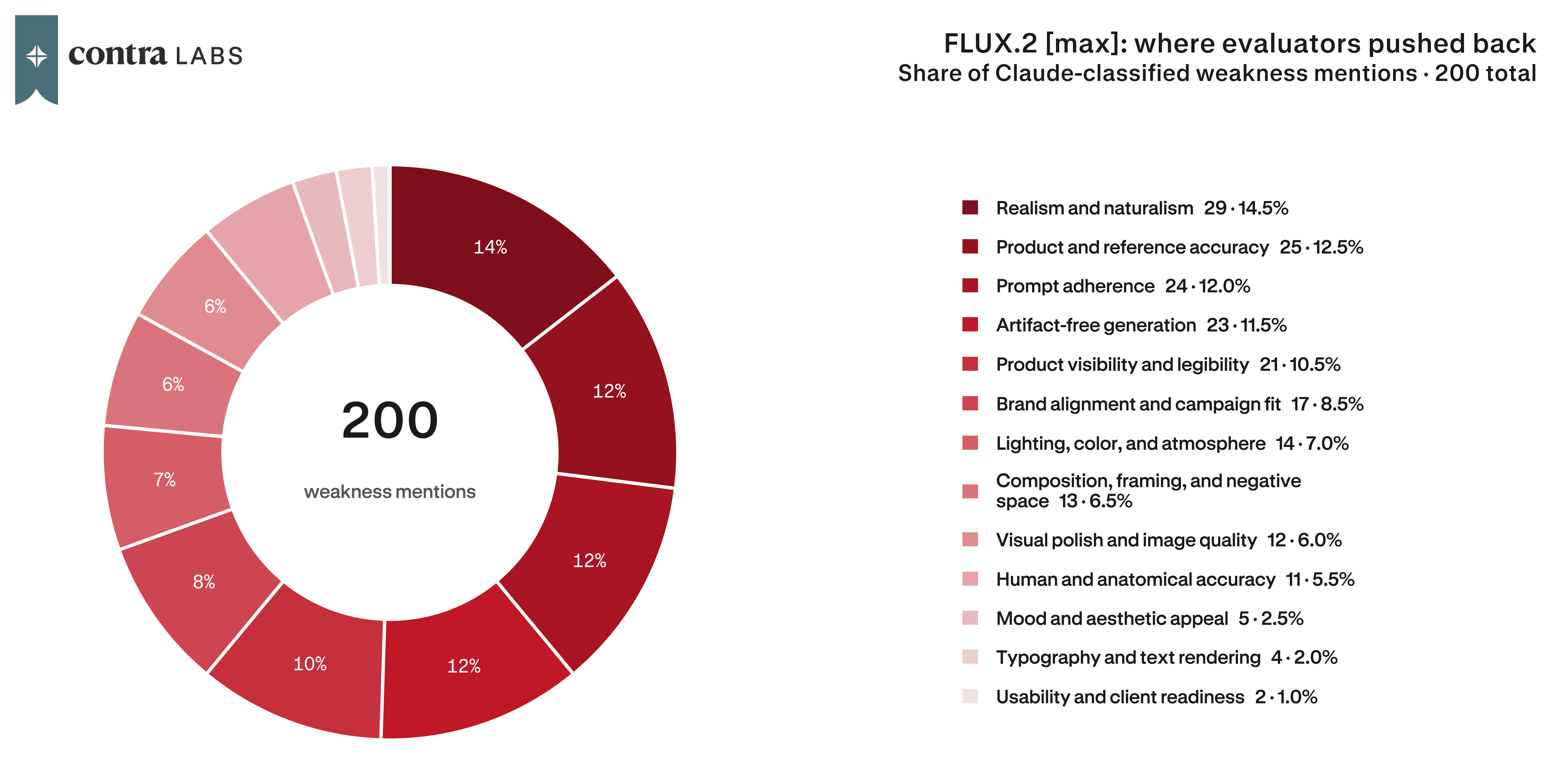
It is the only model with no standout weakness. Designers criticized its outputs for realism, product accuracy, and prompt adherence, each sitting between 11 and 16 percent. When it did fail in the ideation phase, it broke basic physics: a surfboard that "looks like the board is sinking into the sea," a concept panel "where it looks like there are legs growing out of the hiker's back."
Output A looks like the board is sinking into the sea, so Output B is doing a better job at representing the water level, the shot angle from beneath the water and the flow of water on the surface.

Grok Imagine 1.0

Prompt adherence and product accuracy together account for more than a third of its criticism. Evaluators kept finding text nobody requested: an output that "makes claims in text form," an "unecessary text addition," "extra text at the bottom."
The left side output is aesthetically pleasing but features completely incorrect product design. The right side output also features a plethora of mistakes, such as mistakes in the wordmark, a second pool in the lower foreground, and unecessary additional text, but it is still the more accurate out of the two.

Lighting, color, and atmosphere draws 15.0 percent of its praise, second only to product accuracy in its own profile. Its signature failure is the brief. Prompt adherence and product accuracy together account for more than a third of its criticism, so what it tends to produce is beautiful light on the wrong image. Fittingly, it does its best work late in the job, rising from a 28.9 percent win rate at mockup to 47.5 percent at refinement, the largest gain between those phases of any model. The brief has shrunk to one instruction by then, and one instruction is what it can follow.

Krea 2 Medium

It is the only model whose praise skews aesthetic rather than accurate: realism first, mood and atmosphere second, and not one fidelity category in its top five strengths. Its signature failure is the product itself. Product and reference accuracy is 41.8 percent of its criticism, three times its next category, and the rationales read like a returns department: a brand label in the wrong color, straps in the wrong place, a bottle that says RAIIN instead of RAIN.

One evaluator summed it up: "the left side output seems to be taken from a generic stock imagery platform and provides a more poetic or aesthetic view, but doesn't give enough context for a product advertisement." It makes attractive images and inaccurate ads, and it finished last at every phase.
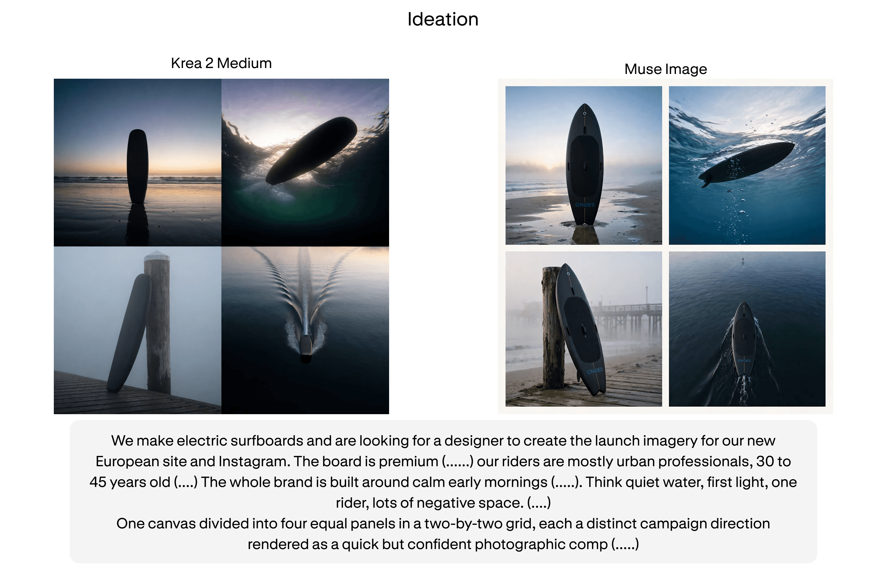
The right side output I think does a better job, considering that clearly shows the brand logo as a product that really belongs to the brand, as well as the overall imagery that shows better the product and its campaign direction as specified on each panel, in a more vivid or refined way. While the left side output seems to be taken from a generic stock imagery platform and provides a more poetic or aesthetic view, but doesn't give enough context for a product advertisement or something that belongs to the Ondes branding. That said, I think the right side output wins in terms of photography direction, product advertising and branding context
What each model is the best for
If you don't want to switch models, use Muse Image, with ChatGPT Images 2.0 as the runner-up. If you want the best of each phase, start ideation with ChatGPT Images 2.0, build the mockup with Muse Image, and run refinement with Muse or Nano Banana Pro. Then route around problems as they come up. If the output keeps drifting from the brief, go to Muse. If the brand logo or label is breaking, go to Nano Banana Pro. If the image feels synthetic or AI-styled, render the locked direction in FLUX.2 max. And if you just need to create a moodboard to discover your direction, Grok Imagine and Krea 2 Medium are worth taking a look at. Just keep the product out of frame until you switch back.
| Job | Pick | Why |
|---|---|---|
| The overall pick, if you only get one | Meta Muse Image | Muse is the only model with no weak phase but budget some time for a pass, since the most common complaint is that its images look slightly unreal. |
| Generating directions from a brief | ChatGPT Images 2.0 | ChatGPT Images 2.0 wins ideation outright. Muse Image follows close behind with the rest of the field thirty or more points of win rate behind. |
| Building the chosen direction into a finished image | Meta Muse Image | Mockup is where Muse pulls away, winning 74.2 percent. It is also the phase where the field spreads widest, so this is the stage where your model choice matters most. |
| Executing someone else's art direction: | FLUX.2 max | Second at mockup despite being nearly last at ideation. If the direction is already locked and you need it rendered, it punches well above its overall ranking. |
| Refining on a specific edit | Meta Muse Image, Nano Banana Pro | At refinement Muse Image, Nano Banana Pro separate by less than a point with ChatGPT Images 2.0 finishing 5 percentage points away. The field converges once the task narrows, so this is the stage to optimize for cost or speed. |
| Mood and atmosphere exploration | Krea 2 Medium, Grok Imagine 1.0. | Krea's praise concentrates in realism and mood and Grok's in lighting and atmosphere with both facing criticisms in product fidelity. |
Limitations
Muse Image was generated through the Meta.ai web app, since no API was available at the time of the experiment. A web app can apply its own prompt handling, safety filtering, or default settings that an API does not, so this difference in harness could have helped or hurt its results. We cannot separate the model from its wrapper here.
With a small pool of designers, three campaigns, and nine prompt chains, each win rate reflects a limited number of people reacting to a limited number of briefs, so a model's result on any one prompt reflects those specific images and those specific evaluators, not a general rate. We treat these findings as directional rather than definitive, and place more weight on patterns that held across all three campaigns and all three phases.
How we ran this study → Methodology