

Kimi K3 arrived with a headline result as Arena ranked it number one on their Frontend Code Arena at 1679 points, a 17-place jump that put it first on human preference votes for the UI code models generate. We wanted to see whether that ranking carries over to everyday design work: building a landing page you could hand to a client. So we gave the same ten briefs to four frontier models, GPT 5.6 Sol, Kimi K3, Gemini 3.5 Flash, and Claude Fable 5, and asked eight designers to compare the results in blind head-to-head matchups, write up the strengths and weaknesses of each model's page, and answer one practical question: would you show this to a client?
Across 480 comparisons, Kimi K3 stayed level with GPT 5.6 Sol the whole way, and pulled slightly ahead on the detailed briefs.
GPT 5.6 Sol won 65% and Kimi K3 won 63% of matchups
GPT 5.6 Sol finished first, winning 65.0% of its matchups (consistent with our previous study results). Kimi K3 came in just behind at 63.3%. The other two were further back: Gemini 3.5 Flash at 38.8% and Claude Fable 5 at 32.9%.

The two leaders were even closer when they went up against each other. Out of the 80 times a designer chose between GPT 5.6 Sol and Kimi K3 directly, GPT 5.6 Sol won 41 and Kimi K3 won 39. That's a two-vote gap, essentially a tie between them head to head.
The head-to-head votes were not the only measure. Designers also looked at each landing page and answered: would you send this to a client? This is a higher bar than winning a matchup, since a page can beat its rival and still not be good enough to ship. Designers marked GPT 5.6 Sol client-ready on 54 of its 80 pages, and Kimi K3 on 49 of its 80. That is 67.5% against 61.3%, a six-point gap. By this second measure they finished close again, with GPT 5.6 Sol just ahead.

On detailed briefs, Kimi K3 edged past GPT 5.6 Sol
The tie holds overall, but not once you separate the detailed briefs. Seven of the ten briefs in this study were detailed. They named the client, stated the goal, and laid out the exact section order the page should follow, from the hero through the feature bands to the closing call to action. The other three handed the model a high-level description and left it to invent its own structure.

On the seven detailed briefs, Kimi K3 came out ahead. It won 63% of its matchups there against 58% for GPT 5.6 Sol. That is a 5-point lead for Kimi K3, the reverse of the overall result, where GPT 5.6 Sol was ahead by about 2 points. Head to head on these briefs, Kimi K3 won 31 of the 56 matchups against GPT 5.6 Sol, a little over half. Client readiness followed the same pattern. On detailed briefs, designers were willing to show Kimi K3's page to a client 57% of the time, ahead of GPT 5.6 Sol at 54%.
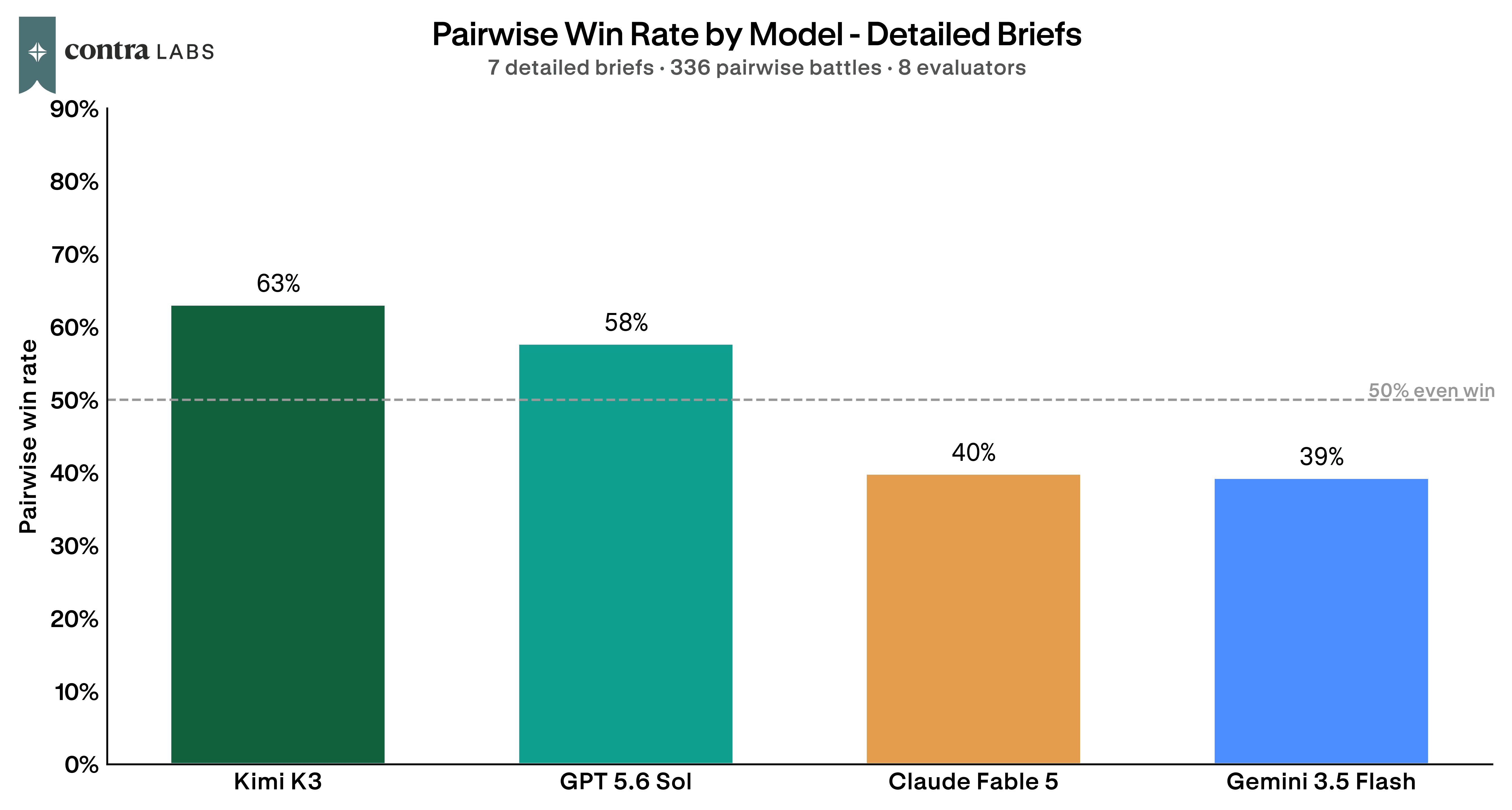
The lead is small and comes from just seven briefs, so it is best read as Kimi K3 nudging ahead rather than pulling away. The edge shows up on both head-to-head and client-readiness measures, which points to a real strength for Kimi K3 on detailed briefs. With a clear, detailed brief, Kimi K3 builds a page with the requested structure, and designers were willing to show the result to a client. The three loose briefs went the other way. There, GPT 5.6 Sol was the stronger of the two and won 16 of their 24 matchups, which is what kept the two so close overall.
Kimi K3's best page was Ashfall, which won 23 of its 24 matchups
The clearest look at Kimi K3 at full strength is Ashfall, a landing page for an indie survival-strategy game chasing wishlists and pre-orders. Kimi K3 won 23 of its 24 comparisons on this brief, its top result of the study, and all eight designers said they would put the page in front of a client.

See the pages here: Kimi K3 · GPT 5.6 Sol · Gemini 3.5 Flash · Claude Fable 5
The brief asked for a full-bleed hero over an atmospheric scene of ash-covered ridgelines, a trailer block, a three-pillar section, and a story band. Kimi K3 delivered the mood, and the designers noticed.
The ash particles, distant ridgelines, warm horizon glow, and small settlement silhouettes give the world a stronger sense of place without becoming overdesigned. The hero finally feels like a game world rather than a dark landing page with text on it.
Another kept it short:
Matches the brief perfectly. Nice illustrations, both in hero and game mechanics section. Smooth motion and interactions.
One pointed to the bookends, the two sections that carry a landing page:
It does a really good job anchoring the hero and the final call to action, arguably the most important sections on the page.
And one designer who ranked it first summed up why:
This is the closest one following the scene described in the prompt. I can tell it's a game from only the hero.
What designers made of Kimi K3: strong at the top of the page, shakier on balance and visuals

The writing was the strongest area of all. Designers praised the copy, the actual words on the page, 25 times against 9 complaints, and it usually sounded like a real product. The pages also felt believable rather than salesy, 12 mentions of praise to 6. At its best, the work read like something a real company had shipped.
It is honest about crisis care, controlled substances, and when in-person care is better, which makes the practice feel trustworthy rather than promotional. That kind of clarity is exactly what a mental health page needs.
The top of the page was a strength too. The opening section, the big banner and headline visitors see first, earned 20 mentions of praise against 12 complaints, and designers could often get the whole pitch from it alone.
The hero headline is excellent: "Build drones that fly where people shouldn't." It is specific, confident, and focused on the work itself.
The most-talked-about area was layout, how the page is arranged and where things sit, and it landed hard on both sides: 40 mentions of praise and 33 of criticism. The trait that produced Kimi K3's best pages also produced its worst ones. On a detailed, section-by-section brief, it stuck close to the layout, colors, and wording. On a loose brief, or one with little to show, the same pages came out crammed on one side or empty on the other.
Logistics section layout as a grid is really unbalanced
Visual design was the clearest weak spot, and the only theme with more complaints than praise, 32 against 24. The complaints were about imagery and sameness: too little real imagery, and a look that could drift toward generic. Text-heavy pages showed it most.
The whole website has the same color with no images, so it is very text heavy and boring to go through.
Close behind was readability, 18 mentions of text that was too low-contrast or too small to read comfortably on a real screen. On top of that were small bugs that showed up here and there: menus that scrolled away instead of staying put, hover effects on things that were not actually clickable, and features the brief asked for that never showed up. Most are quick fixes, and they were the difference between a page that looked done and one that actually was.
Kimi K3 delivers when the brief is detailed
Kimi K3 is a real alternative to GPT 5.6 Sol for landing pages. Across the whole study the two finished within two points of each other, and on the detailed briefs Kimi K3 came out a little ahead on both measures, the head-to-head votes and whether designers would show the page to a client. For designers who write tight briefs and hand the model a section-by-section plan, Kimi K3 is a strong choice, and it made the single best page in the study.
The weak spot shows up on dense, text-heavy pages, where designers wanted more visual variety and cleaner handling of code and long stretches of copy. Kimi K3 is at its best with a clear structure and a brief that has some mood to build, and there it matches the best model in the study.
How we ran the study
We tested four models: GPT 5.6 Sol, Kimi K3, Gemini 3.5 Flash, and Claude Fable 5. Each produced a landing page for the same ten briefs, spanning a newsletter, a couples finance app, an open-source database, a telehealth practice, a robotics careers page, a research course, an indie game, a kids workshop, a record label, and a farm box subscription. Seven of the briefs were detailed and specified the section order. Three were loose and left the structure to the model.
Eight designers reviewed the output. For every brief they compared the models two at a time in blind head-to-head matchups, 480 comparisons in total, and separately judged each individual page on whether they would present it to a client, 320 judgments in total. Win rate is the share of a model's head-to-head matchups it won. Client readiness is the share of pages a designer marked as ready to show a client.
A few things are worth keeping in mind when reading this. It's a focused study, ten briefs judged by eight designers, so the results are best taken as a strong signal rather than a final word, and the loose-brief picture in particular rests on three briefs. Design is a matter of taste, so another group of designers might land somewhere a little different. Each model made one page per brief, which means a single strong or off attempt can nudge a result. And the strengths and weaknesses themes were grouped automatically from written feedback, so those counts are best read as a general guide to what stood out, not precise tallies.
How we ran this study → Methodology