

Anthropic released Claude Opus 5 and calls it state of the art on coding and knowledge work, close to Claude Fable 5. One of the testimonials in Anthropic's release describes the model's work as the best animations and 3D work it had seen from an Opus model. We wanted to see whether that carries over to design work: building a landing page you could hand to a client.
So we ran the same study as last time, after Opus 5 shipped. Ten client brief prompts, four models, one HTML output each. GPT 5.6 Sol, Kimi K3, Claude Fable 5 and Claude Opus 5. Ten designers compared the pages two at a time in blind matchups, wrote up the strengths and weaknesses of every page they saw, and answered one practical question about each one: would you show this to a client?
GPT 5.6 Sol won 65% of matchups, Kimi K3 62%
Across 600 comparisons, GPT 5.6 Sol finished first at 65.3%, with Kimi K3 just behind at 61.7%. Claude Fable 5 came in at 41.7% and Claude Opus 5 at 31.3%.
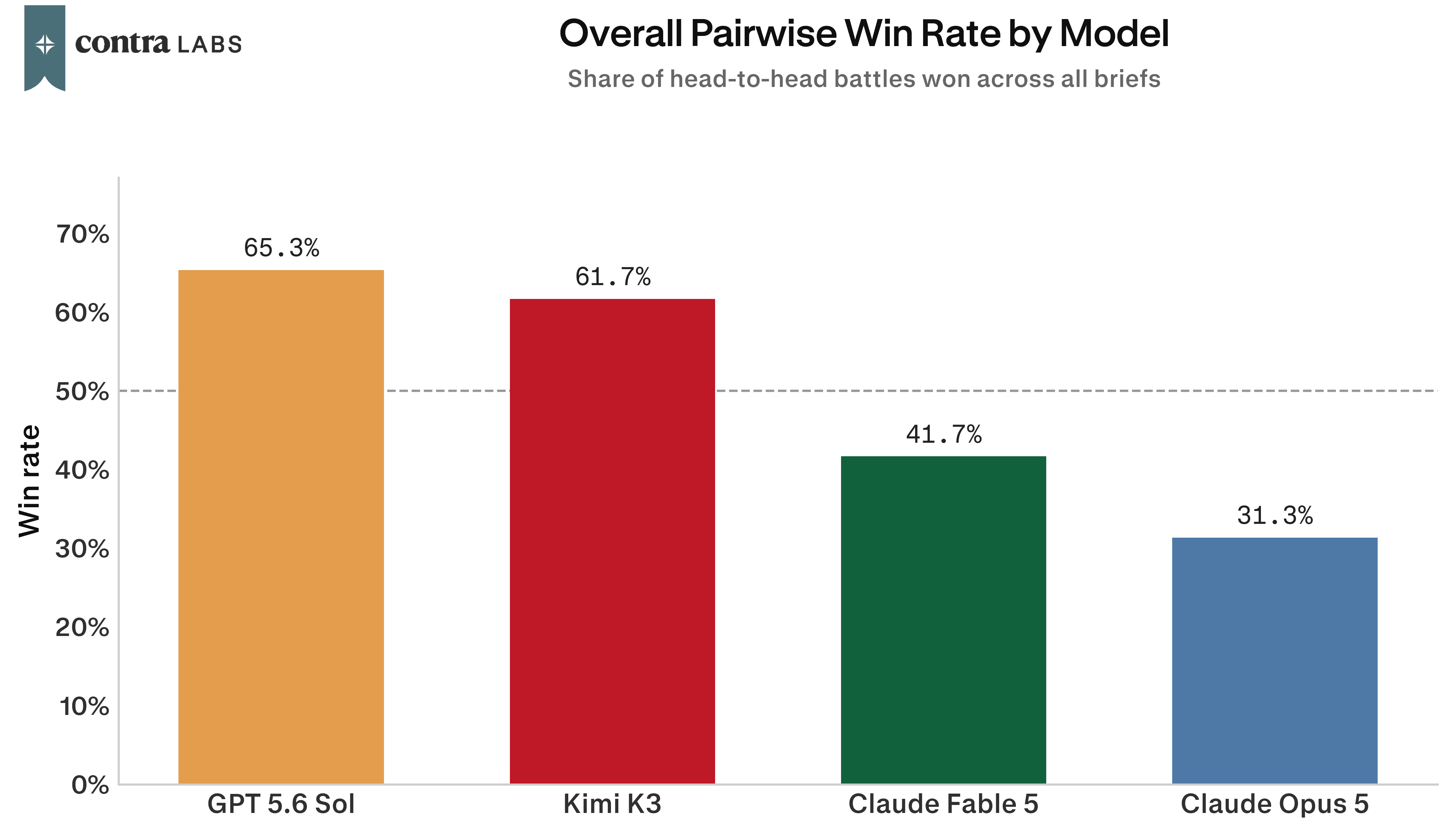
The results are consistent with our previous study, which used the same head to head format and the same kind of client briefs. There, GPT 5.6 Sol won 65.0% of its matchups with Kimi K3 on 63.3%. The gap between these two and the rest of the models has shown up again.
Would you show it to a client?

Designers also judged each page on its own and said whether they would put it in front of a client. That is a higher bar, since a page can win its matchup and still not be ready to send. GPT 5.6 Sol was marked client ready on 72% of its pages, Kimi K3 on 68%, Claude Fable 5 on 47% and Claude Opus 5 on 44%.
Claude Fable 5 and Claude Opus 5, side by side

Designers preferred Fable over Opus 5 in the head to head as it won 62 of their 100 comparisons, and came out ahead on most of the briefs rather than one or two.
On the other hand, client readiness was much closer. Looking at a page on its own, designers were happier to send the Opus 5 version on six of the ten briefs. Over the whole set, 47 of Fable's pages were called client ready against 44 of Opus 5's.
GPT 5.6 Sol was the cheapest and the fastest
Each page cost somewhere between 31 cents and 83 cents to make, and took between two and twelve minutes.

GPT 5.6 Sol came in cheapest at $0.31 a page and quickest at 2.2 minutes. It also won the study, which means the model designers preferred was also the cheapest and fastest. Kimi K3 on the other hand took 11.9 minutes a page, five times GPT's, and finished second.

The two Claude models landed a cent apart, $0.83 for Fable 5 and $0.82 for Opus 5. Per token Opus 5 costs half what Fable 5 does, so to arrive at the same price per page it is generating around twice as many tokens.
What designers made of Claude Opus 5: strong on mood and writing, weaker on the finish

Mood was the strongest thing about these pages. In 48 of the 100 write ups a designer said the page felt right for the client, against 18 who said it missed. Premium, elegant and editorial were some of the words designers used to describe Opus 5's style.
Premium, elegant visual style that matches the heritage brand. Refined typography and neutral color palette fit the brief well.
Typography was the next praised item as it was mentioned in 32 write ups as a strength and in 13 as a weakness. On The Undercurrent brief, the newsletter, most of the page was filled with text as it was the key requirement for the page. One designer called the page a strong execution of the "type does all the work" kind of brief it was.
The actual content and words on the page were an overall strength as well with 22 mentions of praise against 5 complaints. It sounded like a real company wrote it rather than sounding like filler text. On one of the briefs, Peregrine Robotics, a careers page for a drone company, designers picked out the headline and the sign off:

The hero section has a great headline, it's technical and targets the right audience in a single line.
The closing CTA, "none of the five is your job, write to an engineer," is a strong touch that fits the brief's tone.
One of the most common complaint in the whole study was that there was too much of that writing. 32 write ups said a page ran long or moved too slowly, against 4 who liked the pacing. It showed up on nine of the ten briefs, and on Groundwork, the founder summit page, seven designers raised similar complaints.

The page is text-heavy throughout; dense paragraph blocks stack one after another, making it feel like a lot of reading rather than a landing page
Too much text overall, especially the subheadings.
Legibility issues especially small or faint text came up on all ten briefs and were citied as complaints 26 times overall. Designers kept flagging similar things: small print under buttons, captions in a colour too close to the background, and navigation that disappeared into the page behind it.
The small print under the hero CTA buttons has a legibility issue.
The nav bar items have low color contrast against the dark background, making them hard to read at a glance.
Imagery drew more complaints than praise, raised as a weakness in 33 write ups against 20 that liked the visual detail. No brief came with images, so each page had to draw its own with code. On Ledgerline, the finance webinar brief, designers felt there was nothing to look at:

No icons, no illustrations, few colors.
A few simple icons or visual elements would make the page more engaging.
Broken layouts came up in 29 write ups but landed on a handful of pages rather than across the whole set. Designers found small things: headings clipping where two blocks met, a tagline cut off at the bottom of the screen, a backdrop that failed to tile properly. On Tinkershop, the kids workshop brief, one designer flagged a section that had never been filled in:
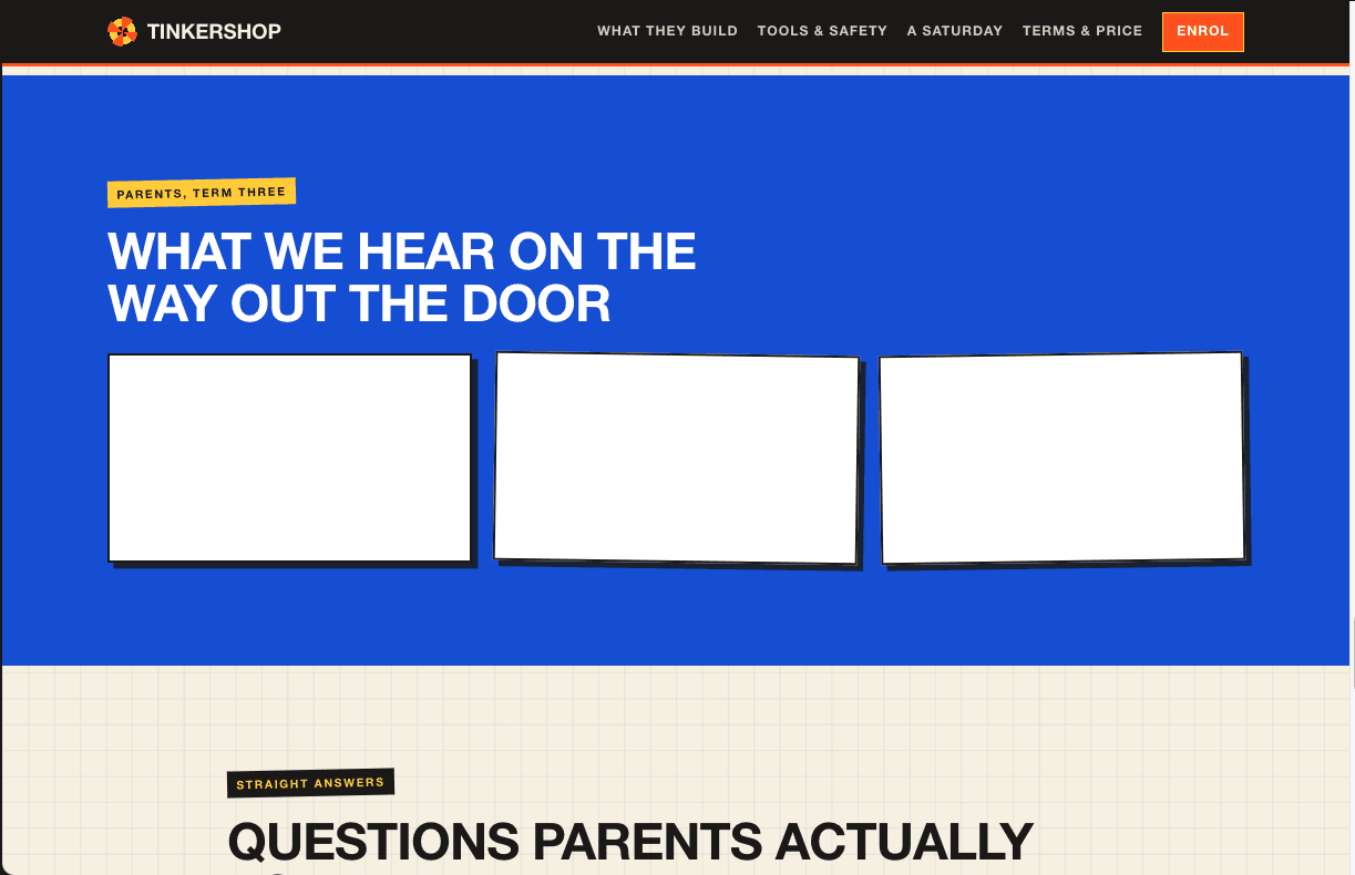
Some sections feel unfortunately unfinished, with what looks like AI generated content placeholder.
The page has the exact energy it needs, I love the checkered backdrop, although it has tiling issues at places.
What this means for Opus 5
Opus 5's best pages were good. The copy sounded like a real company wrote it, the type was well set, and the pages felt right for the client.
The problems were more simple. Text needed more contrast and more size, pages ran long, and a few sections didn't come out properly. A designer could work through that in a pass or two without going back to the brief.
We're running a follow up study on the same pages, with designers marking the specific problems on each one, to find out why some briefs went better than others.
How we ran the study
We tested four models: GPT 5.6 Sol, Kimi K3, Claude Fable 5 and Claude Opus 5. Each produced one landing page for the same ten briefs, covering an indie game, an essay newsletter, incident response tooling, a cold water swim club, a leather goods shop, a finance webinar, a record label, a robotics careers page, a kids workshop and a founder summit. Six of the briefs set out the section order. Four gave a description and left the structure open. Every page was a single self contained HTML file with no external images.
Ten designers reviewed the output. For every brief they compared the models two at a time in blind matchups with no model names shown, 600 comparisons in total. Separately they judged each page on its own and said whether they would present it to a client, 400 judgments in total. Win rate is the share of a model's matchups it won. Client readiness is the share of pages marked ready to show a client.
A few things are worth keeping in mind. This is a focused study, ten briefs judged by ten designers, so the results are best read as a strong signal rather than a final word. Design is a matter of taste, and another group of designers might land somewhere a little different. Each model made one page per brief, which means a single strong or off attempt moves a result, and that matters most for the individual brief numbers. The strengths and weaknesses themes were grouped from written feedback, so those counts are a general guide to what stood out rather than exact tallies.
How we ran this study → Methodology