

Frontier Design: Evaluating AI on Real World Design Tasks
AI models have become much better and faster at design. For the past year, Contra Labs has been carefully evaluating frontier AI models with more than 2 million creative professionals in the Contra network. We consulted top professionals to show how AI has been transforming the creative industry. We have been diligently working with frontier labs to improve models’ creativity and design quality.
But how far have we pushed AI models’ design capability today, really? How is design actually benchmarked?
Most of the design benchmarks run on prompts like “Build a landing page for a coffee shop”. But real world design work isn’t that simple. Of the 4.6k website jobs posted on Contra in the past year, the median brief runs 138 words on a budget of $1,050, and 75% of them stack two or more constraints such as branding assets, target audience, or business goals. Winning on the coffee shop landing page says little about the real world, high value design projects.
Pairwise preference is the main evaluation metrics in design benchmarks. A score doesn’t tell you anything about how to improve the model. Some people may say that your model is better because it is minimalistic, others say that your model has minimal copy–none of these were recorded in the Elo score. It’s a feeling, it’s “taste”, and it’s not supposed to be verifiable. But we believe there are mistakes all designers should avoid, and there are design rubrics we can use to verify design quality.
And who evaluates the design? The voters behind these Elo scores were whoever showed up. Some of them design for a living; most of them don’t. Design is a matter of taste. It is also a profession. On Contra, tens of thousands of designers in 150+ countries have been paid for client projects through the platform. They report a median of eight years in the field.
Today we announce the Frontier Design Benchmark, a research partnership with BenchFlow. Frontier Design is the first design benchmark that builds on real world, high-value design tasks, as evaluated by high-quality professional designers.
Design Tasks
We included 33 tasks as an initial set in Frontier Design. Our goal is to ensure the realism, complexity, and diversity of these tasks to evaluate models’ design capabilities. We based 27 of them on real design jobs posted on Contra, rewritten for fictional clients. After analyzing the 4.6k website jobs posted on Contra in the past year, we summarized that a typical project brief covers:
- the client information and target audience
- website pages and user flows
- branding assets, such as logos
- practical requirements, such as being mobile-first, loading quickly, being accessible, etc.
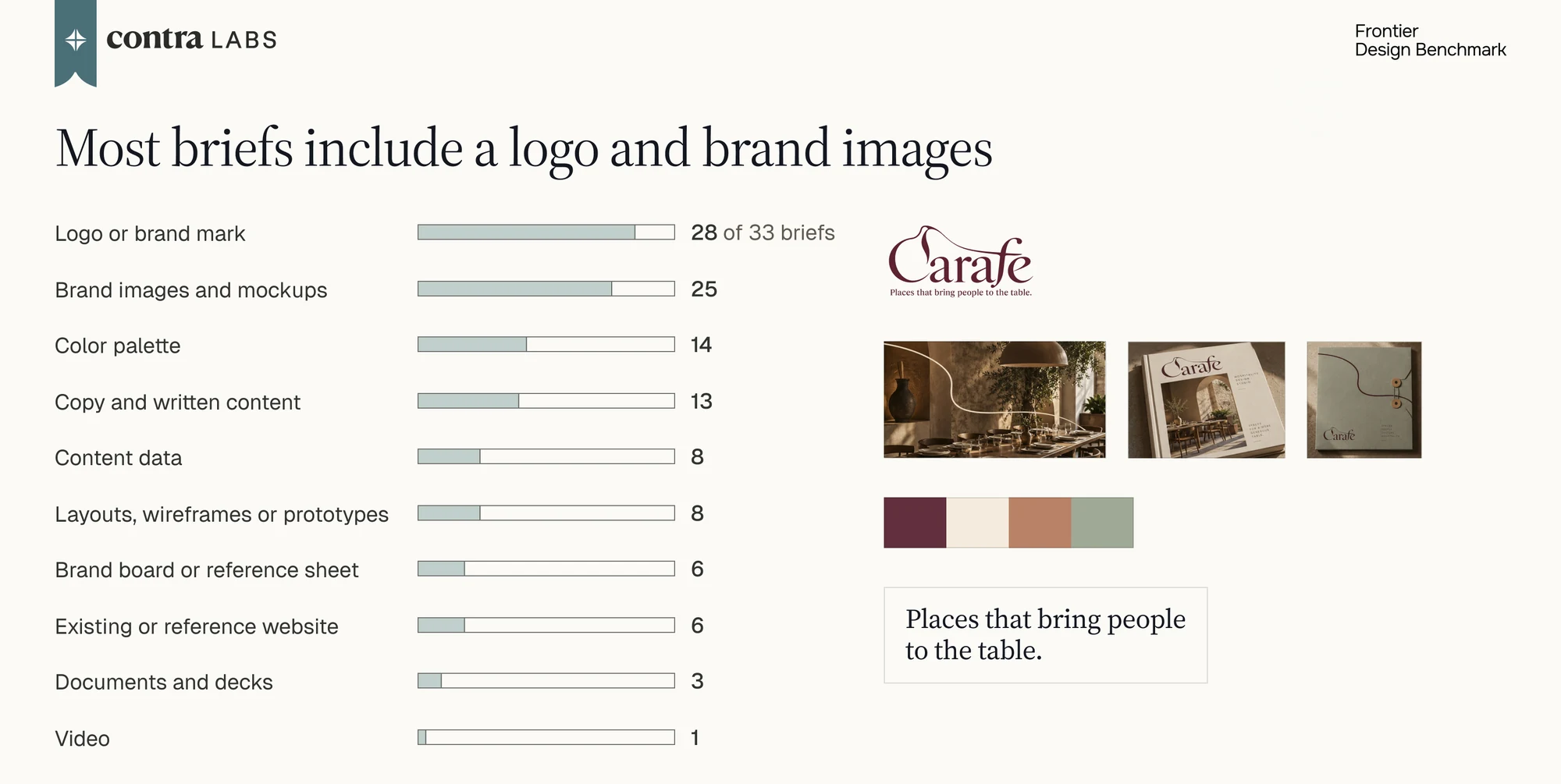
We created tasks including these elements, while ensuring the diversity among tasks. Of the 27 job briefs, 19 give the client’s logo as the starting point, and 17 ask for a site that works well on mobile devices.
The 27 job tasks cover these output types:
- Multi-page marketing sites, such as a festival site that sells tickets and a six-page site for a cybersecurity company
- Landing pages and one-page sites, such as an interactive story site
- Web apps with working flows, such as a crowdfunding checkout, a partner portal with a dashboard, and an online course with quizzes and a certificate
- Mobile apps: an audio tour for a museum and a voice notebook for gallery staff
Notably, we also included 6 design tasks elicited from startup partners. Each task is a real design project the company hired a designer on Contra to work on. These briefs come with the company’s own materials, such as brand assets, files from their current website, product images and decks.
Altogether, the Frontier Design task set lets us evaluate models on the kind of design work clients pay for.
Model Rollouts and Human Golden Designs
To collect model rollouts on the design tasks, we partnered with BenchFlow (benchflow.ai). BenchFlow runs an AI agent on each task in a sandbox and records its output, cost and full trajectory. We used OpenRouter as the model provider. Wherever we could, we ran each model in its own lab’s agent harness.
In addition to model rollouts, we worked with professional designers on Contra to create human golden outputs for the tasks. Designers were first asked to create a moodboard of 3 design directions. We reviewed their moodboards and gave feedback. They then built the site based on the moodboard directions with tools of their choice. After that, our team gave feedback and the designers iterated on the design. We collected these human golden outputs to show what high-quality human design looks like for each task, and to set a goal for AI models to reach.
Evaluation Methodology
Our benchmark reports a combination of three evaluation metrics: expert pairwise preference, the Design Critique Rubric, and an AI Slop Detector.
Expert Preference
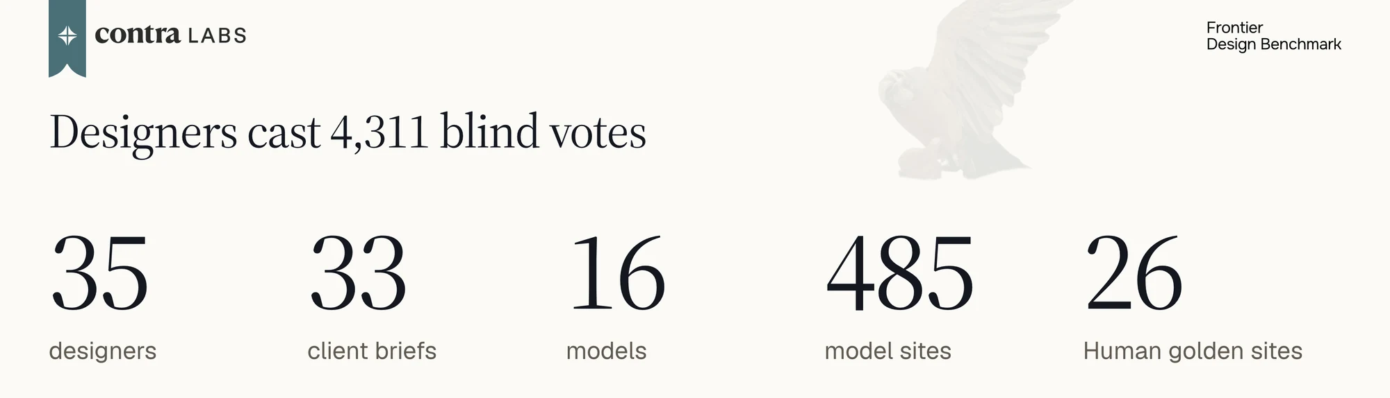
So far we have recruited 35 designers, casting 4,311 votes over five rounds. Each designer is given pairs of designs on the same prompt, answers a general preference question, and optionally explains their choice, covering color, typography, layout, usability and prompt adherence. We turn the votes into a rating per model with a Bradley-Terry model with Elo scores.
We measured repeatability and ranking coherence. We split the designers into two random halves and ranked the models with each half separately. The two rankings agree at Spearman 0.95, averaged over 200 splits.
Design Rubric
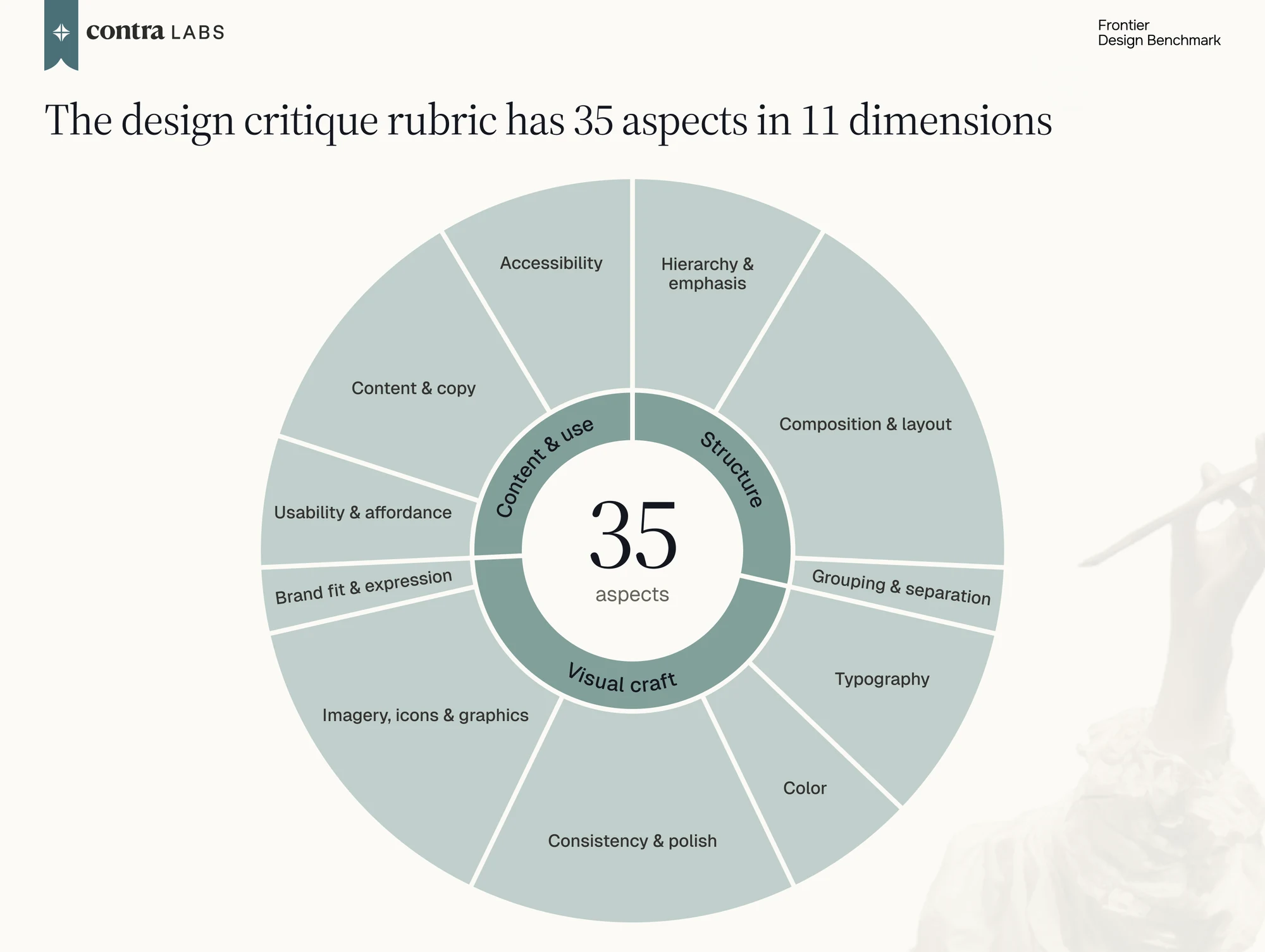
Each design is also graded on a rubric of 34 design dimensions, such as type hierarchy, spacing, contrast, and whether everything renders whole. We used our Human Creativity Benchmark dataset to curate and validate our rubric list. We also recruited professional designers to judge the design, and then check their alignment with the rubrics.
In our analysis, the results of our design rubrics against AI model outputs have a high correlation with the pairwise ranking of models (r = 0.94, Spearman 0.95).
AI Slop Patterns
The Slop Detector measures how AI-made a page looks. A classifier trained on human-made and AI-made pages turns the answers into a reading from 0 to 100, indicating the share of AI-made pages this page looks more AI-like than. It comes with the traits that drove it. Of the features in this classifier, if the designer explicitly considered them not tasteful, then these features are considered “AI slop”.
Benchmark Results
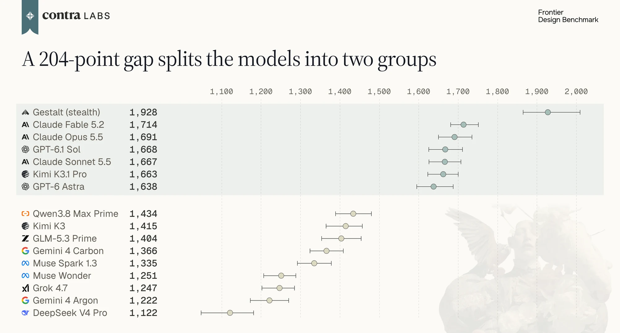
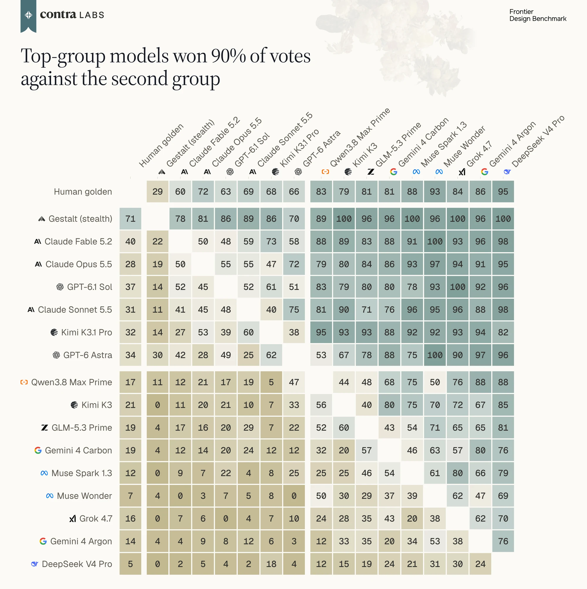
Gestalt (stealth) has the highest Elo, 1,928, and wins 89% of its votes (378 of 423). The highest-rated model we ran, Claude Fable 5.2, is at 1,714. The two are 214 points apart, and their 95% intervals don’t overlap. When designers saw a Gestalt site next to a golden design, they picked Gestalt 20 times out of 28.
The models we ran are starting to split into two groups on design capability. Six models sit between 1,638 and 1,714 Elo: three Claude models, two GPT models, and Kimi K3.1 Pro. Each of them wins 66% to 73% of its votes. The other nine sit between 1,122 and 1,434 and win 12% to 41%. The gap between the two groups is 204 Elo points, more than twice the spread inside the top group.
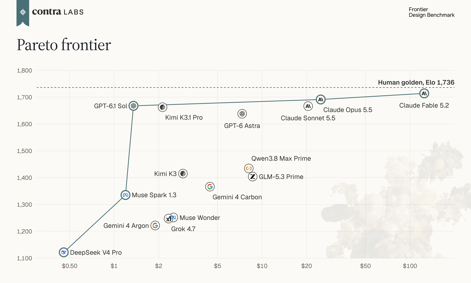
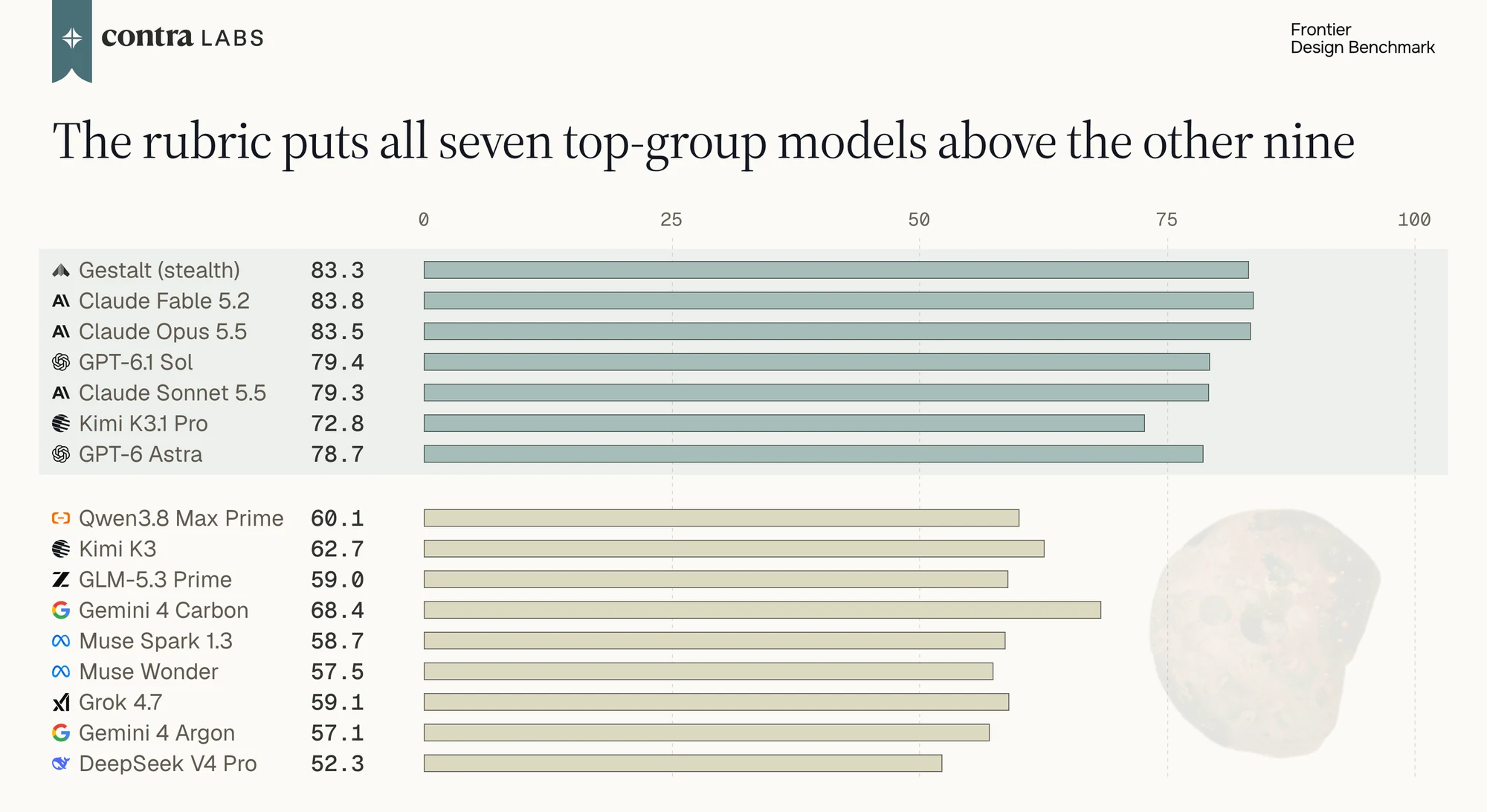
The design rubric ranks the models much the way designers do. Across the 15 models, the rubric score correlates with Elo at r = 0.94. But the two disagree on the human golden designs. They score 73.6 on the rubric, sixth of 16, behind the two GPT models (78.7 and 79.4) and the three Claude models (79.3 to 83.8). They lose points on execution mistakes a designer can point to, such as a button label too dark to read against its background, or a wordmark cut off by the section above it. Designers saw the golden designs with those mistakes and still chose them in 74% of votes (425 of 574). The rubric counts the kind of mistakes all designers should avoid, but it doesn’t measure “taste”, which is what the designers were voting on.
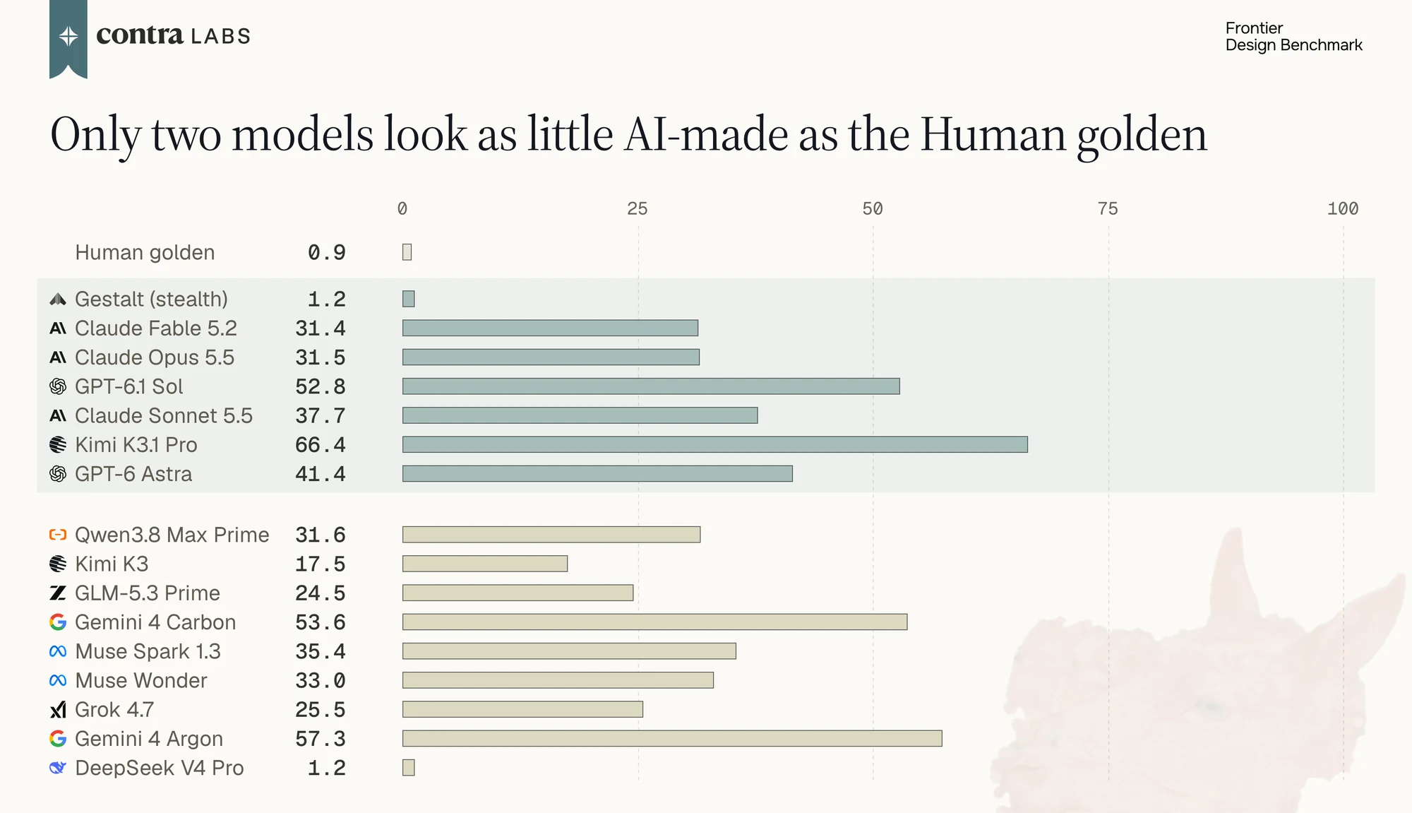
The Slop Detector tells human work apart from model work, and it picks up each model’s quirks. On a 0 to 100 scale, the human golden designs read 0.9 and the models read from 1.2 to 66. Among the models, the reading follows the lab more than the ranking: the three Claude models read 31 to 38, the two GPT models 41 to 53, and the two Gemini models 54 to 57. Two entrants read 1.2, for opposite reasons. DeepSeek V4 Pro is the lowest-ranked model, and many of its pages are unfinished, so they look unlike a typical AI-made page. Gestalt is the highest-rated entrant: its pages are finished, and designers picked them in 89% of votes.
AI slop patterns
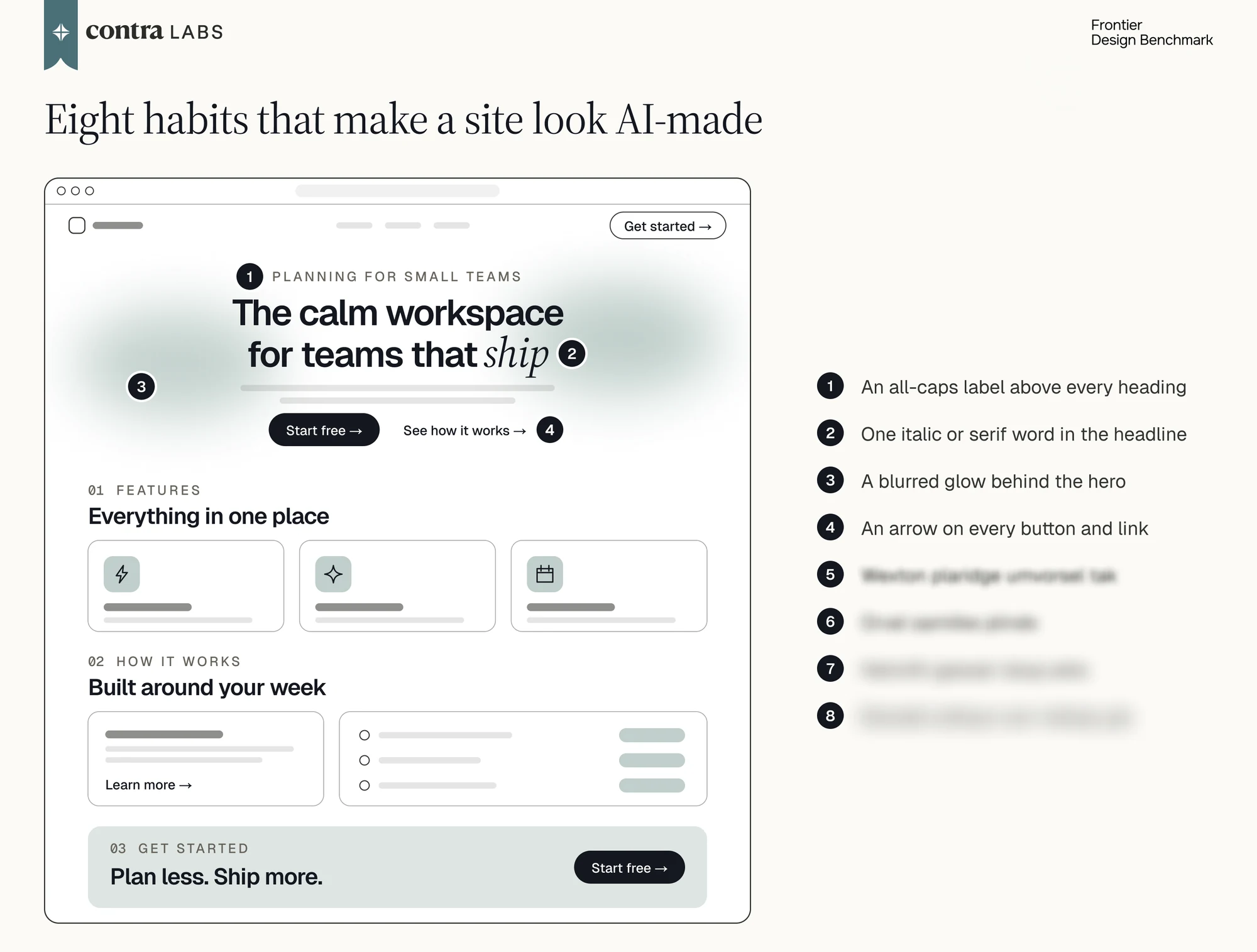
Our AI slop list contains patterns designers call out as AI-looking and that show up far too often on model pages than on human ones. Here is a small subset of AI slop patterns we have curated over time:
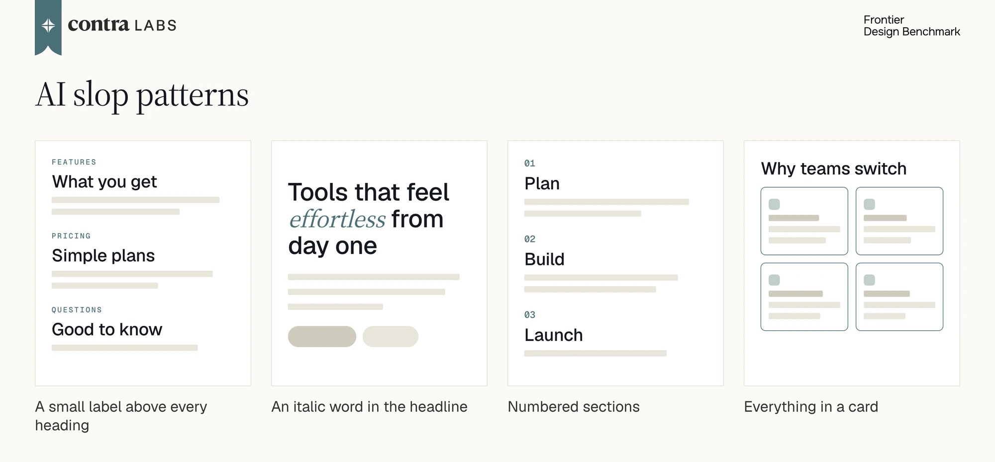
A small label above every heading. A short line of small, spaced-out capitals sits above a section heading and repeats what the heading already says. One designer wrote of four model sites: “They keep using tiny, spaced out uppercase labels above heading, even when the heading already tells me what the section is.” In the Slop Detector’s training set, 93% of AI pages do this on at least half of their sections, against 11% of human pages. In this benchmark, Gemini 4 Argon does it on every page and GPT-6.1 Sol on 96%.
An italic word in the headline. One word or line of the main headline is set in italics for emphasis. A designer brought it up while explaining a vote: the winning site had “no AI patterns like italicized type in the title, blue highlighted spans in titles, mini subtexts everywhere.” Kimi K3.1 Pro does this on 60% of its pages and GPT-6 Astra on 53%. One of the 19 human golden designs does.
Numbered sections. The main sections carry an index: 01, 02, 03. No human page in the training set does this, and neither does any human golden design. It shows up on 17% of AI pages in the training set, and Gemini 4 Argon numbers its sections on 42% of its pages, with Kimi K3.1 Pro and Gemini 4 Carbon at 40%.
Everything in a card. Most of the content sits in its own bordered or filled box. This is the Gemini and Muse signature: Gemini 4 Argon and Gemini 4 Carbon on 92% of their pages, and Muse Spark 1.3 on 88%.
These AI slop patterns will evolve as model capabilities increase, so we plan to constantly update our slop pattern list in the future.
Model quirks
We call something a quirk when one model, or one lab’s models, do it far more often than models from other labs.
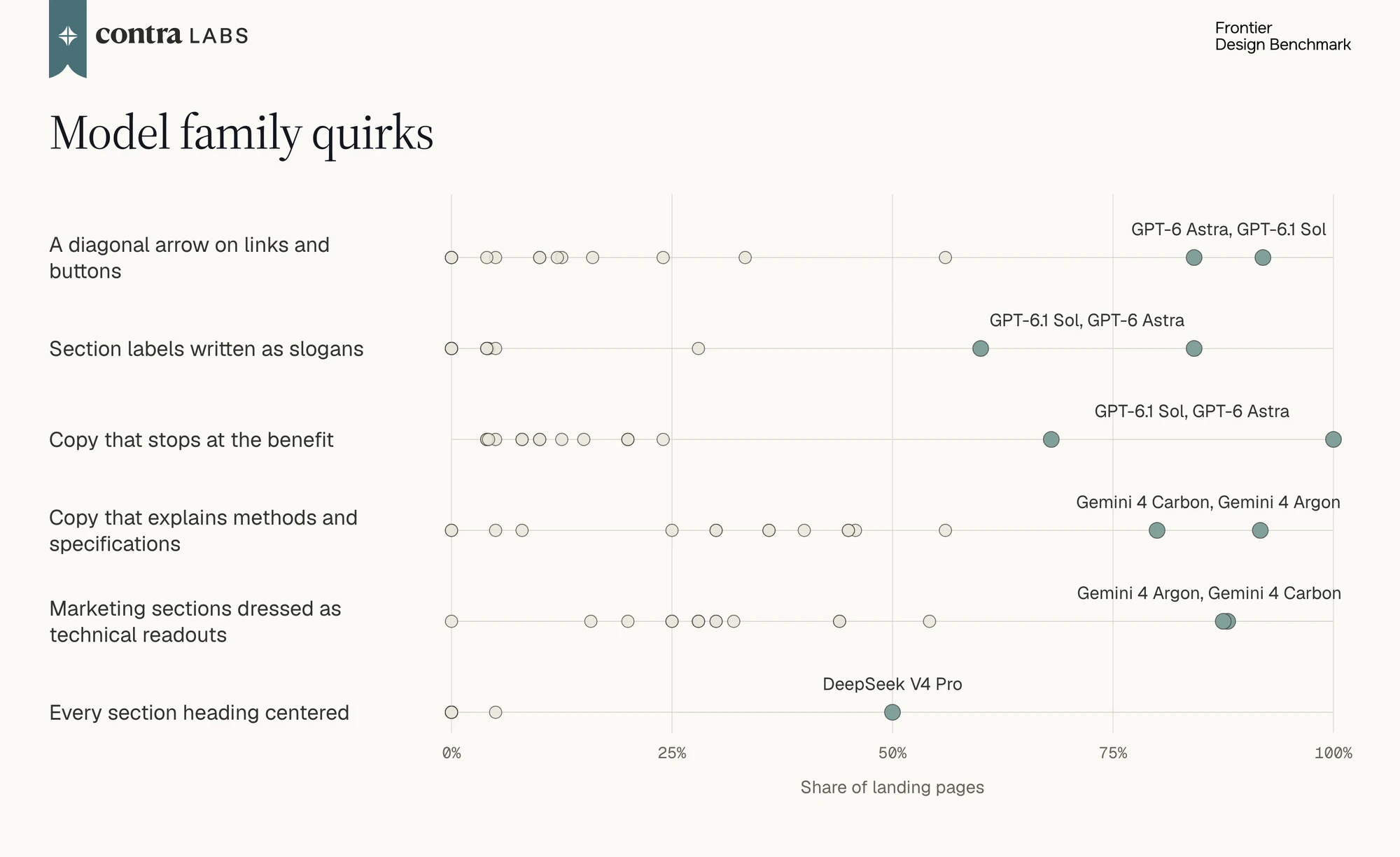
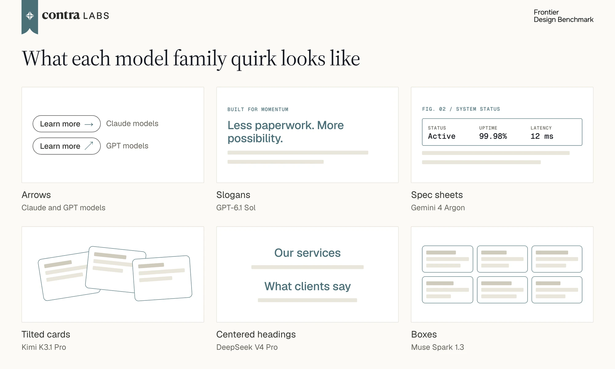
Arrows. You can tell the lab by its arrows. Claude models put a horizontal arrow (→) on links and buttons: Fable 5.2 on 88% of its pages, Opus 5.5 on 80%, and Sonnet 5.5 on 90%, against 49% for other labs. GPT models use a diagonal arrow (↗): GPT-6 Astra on 84% of its pages and GPT-6.1 Sol on 92%, against 15% elsewhere. DeepSeek V4 Pro and Grok 4.7 use no arrows at all on more than 85% of their pages.
Slogans. On 48% of GPT-6.1 Sol’s pages, against 2% for other labs, most headings are slogans of two or three short parallel phrases, such as “Less paperwork. More possibility.” The small labels above its sections are slogans too, where other models write plain topic names (60% against 4%). Its body copy stops at the benefit and doesn’t say how the product works (68% against 11%).
Spec sheets. Gemini 4 Argon goes the other way and explains methods, conditions, and specifications on 92% of its pages, against 29% elsewhere. Its supporting sentences chain several claims together (46% against 4%). It also dresses ordinary marketing sections up as technical readouts, with status labels and figure references, on 88% of its pages (30% elsewhere), and on 92% it stacks three or more tiers of small labels under a heading.
Tilted cards. Kimi K3.1 Pro sets cards, phones, and stickers at an angle on 64% of its pages, against 30% for other labs. Every one of its pages has a headline more than four times the height of the body text, against 68% of pages elsewhere.
Centered headings. On 50% of DeepSeek V4 Pro’s pages, every section heading is centered. Across all the other labs, that happens on 1 page in 322.
Boxes. On 88% of its pages, Muse Spark 1.3 puts nearly every content group in a bordered card, against 60% elsewhere.
New Frontier Design Model Preview: Gestalt (Stealth)
We are excited to preview Gestalt on Frontier Design Bench, a high-quality design model currently in stealth. Professional designers evaluated Gestalt on our design task set in the same blind voting configuration, and Gestalt topped the leaderboard at 1,928 Elo, ahead of all leading frontier models at a solid margin.
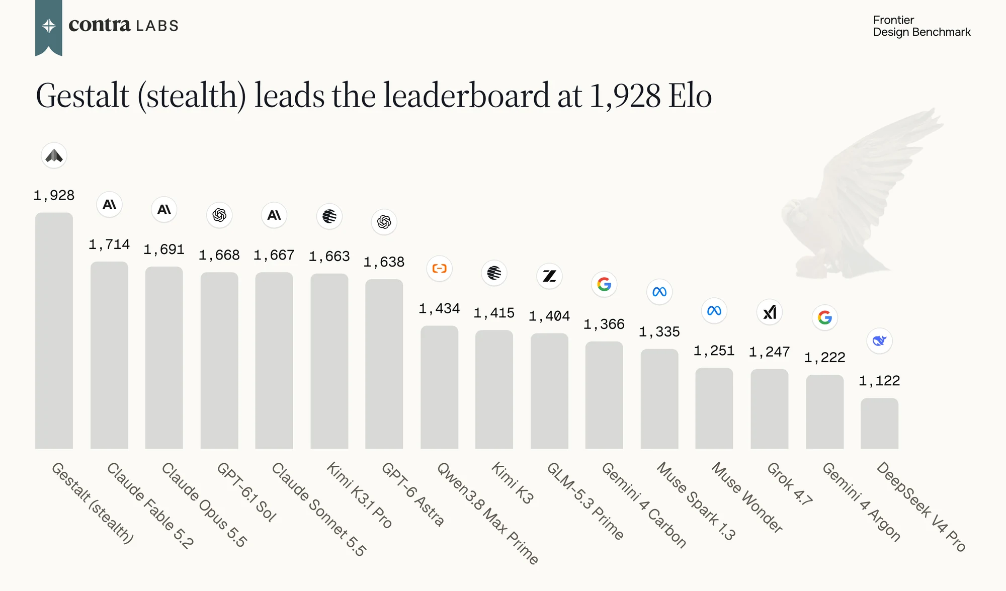
Gestalt was also the first model rated above the human golden designs. Based on our Slop Detector, Gestalt outputs are significantly less AI-looking, almost on par with human golden designs. Our results showed that Gestalt is establishing the new frontier for AI design quality.
As reported in our Creative Intelligence report, AI models have been shaping designer workflows and designer capabilities are evolving with AI. Next, we are excited to see how far designers can go with Gestalt. We are working with the team to continuously evaluate its quality and provide feedback. As models raise the floor and open the ceiling, we believe human creativity will keep pushing with AI to the next frontier.
Conclusion
Frontier Design is the first benchmark to evaluate AI models on real world, high value, and complex design projects. In addition to the pairwise ranking, we built a design rubric whose scores line up with the designers’ ranking of the models, and a list of AI slop patterns that shows what makes a page look AI-made. The 33 design tasks are an initial set, and we will add more real briefs, models, and design artifacts as the benchmark grows. We also plan to constantly update the AI slop pattern list as AI models keep evolving.
We at Contra Labs continue to evaluate frontier models and provide high-quality data to improve model design capabilities. If you are interested in real-world tasks, golden designs from professional designers, pairwise preference, and designer critiques, book a call with our partnerships team.