

We put Claude Fable 5 against Claude Opus 4.8 on real landing page briefs, judged blind by 9 working designers. The overall score was a coin flip. The prompt decided the winner: Fable's best-briefed page won 88.9% of its matchups, its worst-briefed page won 11.1%.
When Anthropic released Claude Fable 5, the benchmarks lit up. Cursor called it state of the art. Replit and Genspark put it first on their leaderboards, and people kept sharing clips of it building whole apps from a single prompt. But does one-shotting an app mean good design, the kind a designer would put their name on? We ran it against Claude Opus 4.8, the strongest Claude designer we'd benchmarked, on the work our community actually sells. Five landing page and portfolio briefs, both models building in Claude Code, every output judged blind by 9 working designers.
The overall scores were nearly identical. Fable took 46 of 90 head-to-head rankings (51.1%), and designers said they'd present 60% of its pages to a client, against 57.8% for Opus. But the annotations tell a different story. Across 475 structured tags, evaluators flagged Fable 217 times to Opus's 258. Fable drew a third fewer layout and spacing complaints than Opus (47 vs 69 tags) and 38% fewer typography flags (23 vs 37), which nearly vanished from the blocker tier. Opus drew nearly twice as many blocker-severity flags as Fable, 34 to 18. These are the 'I would not ship this' issues. Fable's one regression is color and contrast, where it drew 31 tags to Opus's 21.

The brief decided the winner
Crimson Press and Portal, the two most spec-like briefs, each won 88.9% of their matchups, and every Portal output was rated client-ready. Obsidian, the loosest brief, won 11.1% and produced zero client-ready pages. Same model, same task, a 78-point swing decided by the brief.
The pattern holds across all five briefs, not just the extremes. We scored each one on how much explicit design direction it carried: type scale, spacing system, layout skeleton, palette, references. The more structure a brief had, the better Fable did (r = 0.43). For anyone designing with these tools, that is the practical takeaway. In this study, the brief predicted Fable's win rate better than anything else we measured.

Anatomy of a winning brief
The best briefs were shorter on average than the worst ones (678 words vs 792), and they spent those words differently. Winners put more into spacing and grid direction (+3 mentions per prompt), type direction, reference URLs, and tone adjectives. Losers put more into page copy (7 more content-structure mentions) and palette detail (3 more mentions). Color direction itself wasn't the problem, since the winning briefs specified palettes too. The difference was allocation: winners spent their extra words on structure, losers spent theirs on copy and color.
Worked: "No soft gradients, no rounded pill buttons, no pastel glass."
Didn't: "...so the page reads as sophisticated, depth focused, and modern."
Crimson Press, which won 88.9% of its matchups, shows the pattern in practice. It opens with a mood line: "loud, editorial, and tactile, like a fashion magazine crossed with a brutalist zine." Then it immediately converts that mood into constraints. "No soft gradients, no rounded pill buttons, no pastel glass." Type is specified with both family and weight: a heavy grotesk in the Archivo or Inter family at 800 to 900, uppercase. Spacing gets a structure, a centered column about five xl wide with generous padding. Even motion gets a range: snappy, 150 to 700 milliseconds, no bouncy easing. Every decision the model could have fumbled is fenced off in advance.
The pattern reads like a creative director's brief versus a mood board. Give Fable constraints and it executes. Keep it loose and it plays safe, and safe reads generic.
Generic is the dealbreaker
The annotation data also answered a question we didn't ask: what actually makes a designer refuse to ship a page?
Looking generic. An "originality / generic feel" tag raised the odds a page was judged not client-ready by 30 percentage points (odds ratio 3.36), exactly the same penalty as a blocker-severity bug. Color and contrast issues, the thing prompt-writers micromanage most, barely moved the needle (odds ratio 0.88).
The evaluators' own words show the difference. One designer rejected a page for originality, writing
The project cards rely on very similar grayscale portraits. Adding more variety to the imagery would make the selected works feel more curated and less repetitive. There's no visual variation in subject matter. Image all over looks same, Should use real images instead of placeholder images
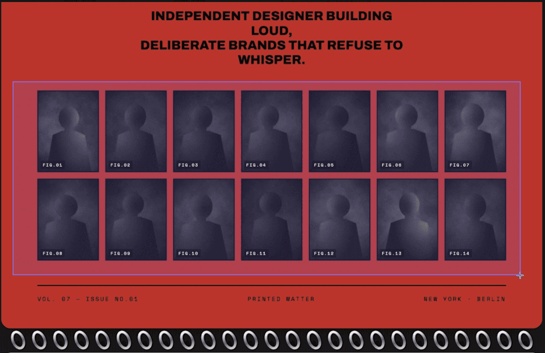
On another page, a designer flagged a major color & contrast issue. That page was still client-ready. The flaw they could fix got a pass. The flaw that made the page feel like everyone else's didn't.
The hero subtext overlaps with the phone, making it harder to read and disrupting the overall layout. Text is not readable.

Fable drew fewer generic-feel tags than Opus (17 vs 22), and its blocker-flagged pages were forgiven far more often: 54% were still rated client-ready, versus just 17% of Opus's. Designers will ship a page with a flaw. They won't ship a page that looks like everyone else's.

The practical read: your direction budget goes furthest on what makes the page specific. References, tone, and spacing rhythm moved outcomes. Palette detail moved them least, and of all the failure types, color and contrast issues were the least likely to cost a page its client-ready rating (odds ratio 0.88).
The takeaway
The briefs that won shared a pattern: a type scale, a spacing rhythm, a layout skeleton, and references. They were shorter than the ones that lost. They spent their words on constraints the model could execute, not adjectives it had to interpret. If you're briefing Fable, write like a creative director handing off to a junior designer: be specific about structure, don't lean on color detail to carry the brief, and point to examples of what you mean instead of describing how it should "feel."
The broader point is that the prompt is now a design decision. The 78-point swing in this study wasn't between two models. It was between the best brief and the worst brief. As these tools get closer to each other in raw capability, the gap between a good output and a bad one moves from the model to the person writing the brief. Choosing the right tool still matters. Knowing how to talk to it matters more.
Fable still has room to close. Color and contrast is the one category where it trailed Opus, drawing more flags across all severity levels. Polish and consistency, things like misaligned elements, inconsistent hover states, and unfinished details, remained the noisiest category for both models but is where a designer will spend the most cleanup time. A well-structured brief gets Fable most of the way there but the last mile would require manual intervention.
Methodology & Limitations
Nine working designers in UI/UX and web design, sourced from Contra's top-earning talent, evaluated five landing page and portfolio briefs. Each brief carried explicit design direction: type scale, spacing system, layout skeleton, palette, references. Each prompt was run through both models using Claude Code with the same standardized generation prompt. Both models produced vanilla HTML/CSS/JS outputs presented as live, interactive artifacts.
Evaluators saw both outputs side by side, blinded and randomized, and selected their preferred output with a written rationale. They independently assessed each output for client readiness. An annotation panel tagged every design issue using an eight-category failure taxonomy with three severity levels (blocker, major, minor), applied per-section so the same tag could appear multiple times on a single output when the issue recurred. This produced 90 head-to-head rankings and 475 structured annotations.
Ninety rankings and nine evaluators is a real signal on the prompt effect and a thin one on the model gap. No single failure tag cleared p < 0.05 between models, tag-level inter-rater agreement was low, and every brief carried some explicit direction, so treat the structure effect as a strong observed pattern, not a controlled experiment.
How we ran this study → Methodology