

Our first study asked designers to choose between pages and decide whether they'd show each one to a client. It covered ten landing-page briefs. The written feedback praised Opus 5's copy and mood, and it repeatedly pointed to sections that felt unfinished.
For this follow-up, we returned to five of those briefs. Nine designers reviewed 20 pages one at a time, marking specific problems and rating how serious they were. Across the 20 pages, the designers left 738 annotations, ranging from small details to issues that would keep them from presenting a page to a client. On the Opus 5 pages, designers most often flagged how content was arranged and spaced, along with text that was difficult to read because of its size or contrast.
How annotations were recorded and rated
An annotation points to a specific part of a page that a designer thought needed work. Designers could attach one or more design issue types to it. The available types were Layout, spacing and hierarchy; Typography; Colour and contrast; Copy and content; Interaction and affordances; Rendering and breakage; Brand fit and tone; Polish and consistency; and Originality or generic feel.
They also rated severity:
- Minor: would not stop the designer from presenting the page.
- Major: needs rework before the page could be presented.
- Blocker: the page could not be presented while the issue remained.
Some annotations carried several issue types, which is why the tag totals exceed the number of annotations.
What designers flagged on Opus 5 and how it compared with the other models
Across its five pages, Opus 5 received 208 design issue annotations. GPT 5.6 Sol received 184, followed by Kimi K3 at 174 and Claude Fable 5 at 172.
The severity ratings give us a better sense of how serious those issues were as raw totals only tell part of the story. Across all four models, 72 annotations didn't have a severity rating, so we excluded them from this comparison. Of the 208 Opus annotations, 183 were rated: 68 were Minor, 86 were Major and 29 were Blockers.
Nearly two in three of those rated Opus annotations described issues that needed rework before the page could be shown to a client. For the other models, that share ranged from 48% to 53%. On these pages, an Opus annotation was more likely to describe substantial work than a small piece of polish.

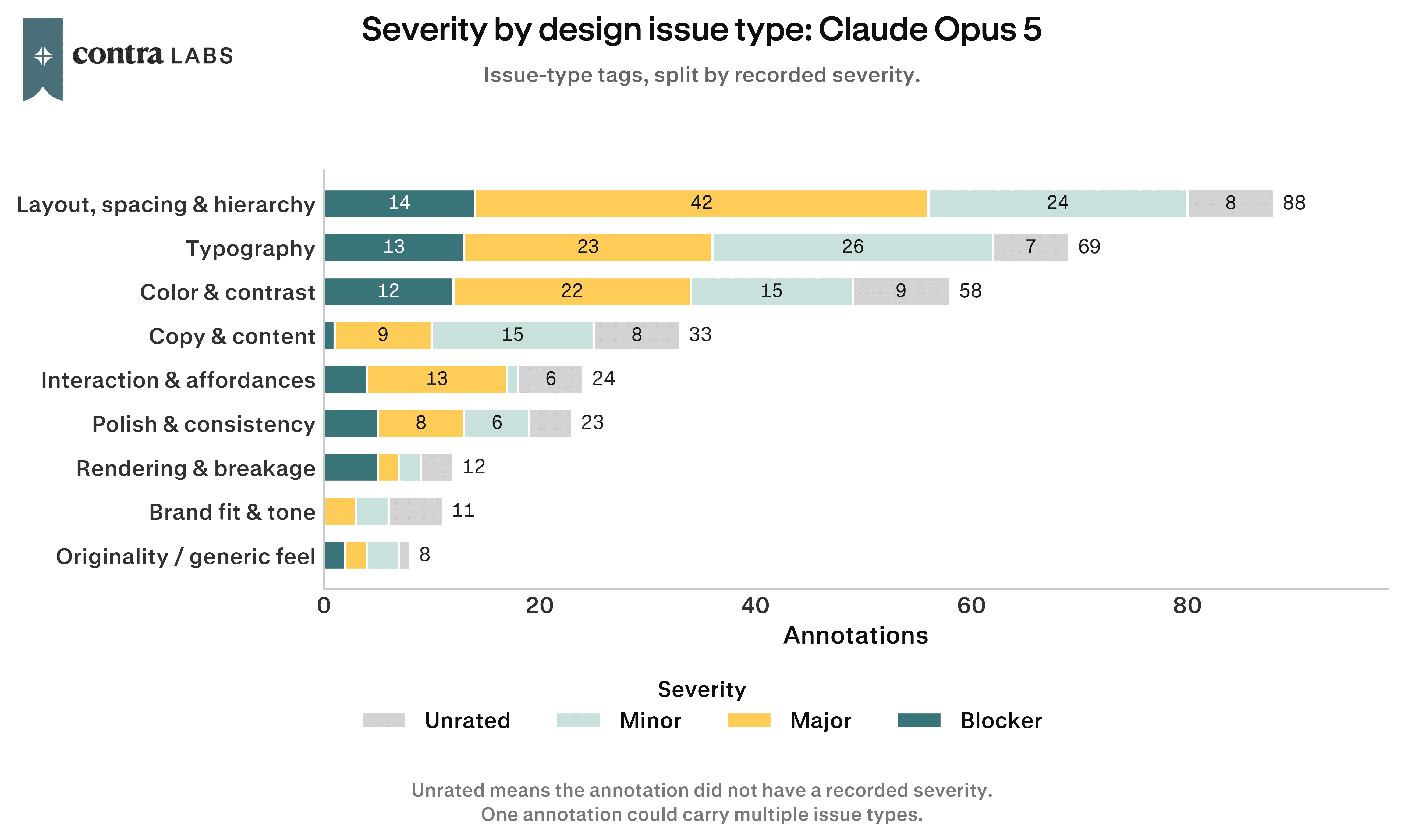
The most common issues on the Opus pages involved structure and readability. Layout, spacing and hierarchy was tagged 88 times. Typography appeared 69 times, and colour and contrast 58.
The labels often overlapped within the same element: an oversized heading could affect typography and hierarchy, while a faint button label could raise issues with type and contrast. These were also the most common issue types among Blockers, with layout tagged 14 times, typography 13 times and colour and contrast 12 times.
Designers marked grids that didn't line up, headings that overwhelmed nearby content and text that faded into its background. Together, these problems made the pages harder to scan and read.
Switchboard: layout problems in the timeline and pricing
The Switchboard brief was for a tool used by on-call engineering teams. Opus 5's version made that audience clear in the hero, which paired a terminal preview with restrained design. The copy was direct and matched the tone of the brief.
Designers repeatedly flagged inconsistent alignment between sections and supporting text that was difficult to read because of its size or contrast. Text overlapped inside the timeline, diagrams were squeezed into narrow columns and the pricing cards didn't align. One tier sat below the others, with large empty areas beside cramped content.
The timeline was meant to explain how Switchboard works, and the pricing cards were meant to help visitors compare plans but the layout made both sections harder to follow.
Switchboard drew 44 annotations for Opus 5. Twenty were Major, nine were Blockers and 30 carried the Layout, spacing and hierarchy tag.
Parts of the timeline overlap, making the sequence harder to follow. The diagram feels visually broken rather than intentionally layered.

Typography style and text readability
Designers generally liked Opus 5's typography in the first study, mentioning it positively 32 times and negatively 13 times. The closer review focused on individual elements and found a recurring readability problem. Smaller text, labels and button copy were often difficult to read because of their size or low contrast.
Typography was tagged 69 times. In 31 annotations, it appeared alongside colour and contrast, and 23 of those issues were rated Major or Blocker.
The Ashfall page shows how this affected an otherwise strong visual direction. The brief called for a dark, atmospheric landing page for an indie survival-strategy game. Opus 5 captured that identity through its palette and large display type. Fifteen Ashfall annotations combined Typography and Colour and contrast, with designers pointing to faint supporting copy and button labels that blended into the background. Increasing the size and contrast of supporting text could address many of these issues without changing Ashfall's overall visual direction.
The supporting text blends into the background, making it difficult to read. Stronger contrast would improve readability

Opus 5 stayed strong on brand fit and originality
In the first study, designers responded well to the tone and identity of the Opus 5 pages. The pages often felt tailored to the client and the brief as Mood received 48 positive mentions and 18 negative ones. Writing and content received 22 positive mentions and five negative ones.
The annotation study points in a similar direction. Designers flagged Brand fit and tone 11 times for Opus 5, compared with 18 to 22 times for the other models. Originality or generic feel was flagged eight times for Opus, compared with 13 to 19 times elsewhere.
The annotation task asked designers to identify problems, so lower counts aren't direct praise. They do show that designers found fewer problems with brand fit and originality on the Opus pages. This suggests that improvements to Opus 5 should focus more on layout and readability, where designers found the most issues.
Where Opus 5 can improve
Across the five briefs, the clearest areas for improvement were layout and readability. Designers repeatedly flagged layouts that lost alignment further down the page and supporting text that became difficult to read because of its size or contrast.
To produce better outputs, Opus 5 needs a stronger review of the full rendered page. Spacing and hierarchy should remain consistent from one section to the next, and smaller text should stay readable against its background. Much of the copy, mood and visual direction already works well. More consistent execution would help those strengths carry through the entire page and make the result feel ready to share with a client.
How we ran the study and what to keep in mind
We tested four models: GPT 5.6 Sol, Kimi K3, Claude Fable 5 and Claude Opus 5. Each produced one landing page for the same five client briefs: Ashfall, The Undercurrent, Switchboard, Longwave and Peregrine Robotics. These were five of the ten briefs used in the original head-to-head study.
Nine designers reviewed the 20 pages. Each page was shown on its own, in random order, with no model name. There weren't any matchups or winners to choose. Designers were asked to mark four or five areas that would need work before the page could be presented to a client.
The designers left 738 annotations. Of those, 666 had a recorded severity and 72 didn't. All severity comparisons in this article use the rated annotations. Since designers could assign several issue types to one annotation, issue type counts don't add up to 738.
Five briefs and one output per model is a small sample. A single strong or weak generation can move the totals. We also removed each model's most-tagged page to check whether one output was driving the results. Opus 5 still had the highest annotation total and the most Major issues and Blockers.
Each designer was asked to find four or five problems on a page, so raw annotation volume reflects the task design as well as page quality. The study can't measure strengths on its own. Those observations also draw on written feedback from the first study.
Design remains a matter of judgment. Another group might mark different elements or rate severity differently. These numbers describe 20 pages, not every landing-page task.
How we ran this study → Methodology